Our 2023 Q4 Investment Update
After a challenging 2022, fixed income and equity markets surged higher in 2023 as a resilient economy defied gloomy expectations. A strong Q4 rally, sparked by growing expectations that interest rates have peaked, catapulted portfolios above their 2022 highs.
For our Q4 investment update, we have compiled a series of charts that provide an overview of investment performance, address the most frequently asked questions among clients, and dig into the most prevalent themes in the headlines.
Table of Contents
- Historical Expansions/Contractions
- Component Performance: Tracking the Recovery
- Lightning Strikes in Q4
- Market Expectations for Interest Rate Policy
- Interest Rates: US Treasury Yield Curve
- Inflation Trends
- Calibrating Portfolio Positioning
Historical Expansions/Contractions
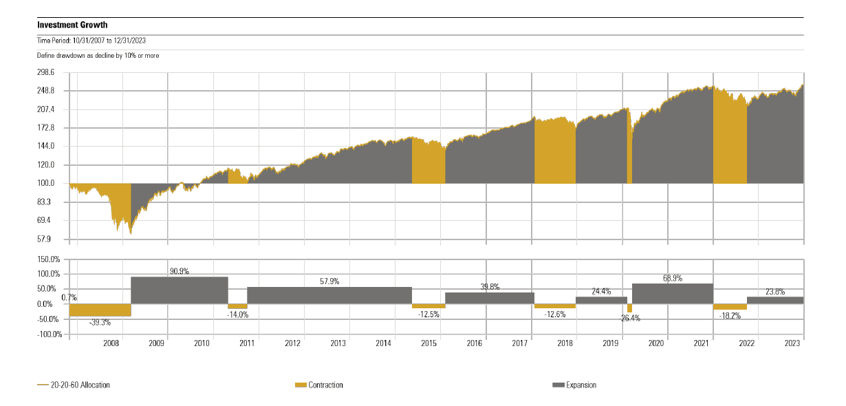
About this Chart:
This chart shows the growth of a moderate risk portfolio—with a 60% weighting to stocks—since the peak of the market before the 2008 global financial crisis. The bottom half of the page shows the length and magnitude of expansionary and contractionary periods during the approximate fifteen years shown.
While it is typical for investment returns to be presented using standardized date periods, such as calendar year or annualized trailing periods, analyzing historical performance via expansionary and contractionary runs offers a more complete picture of market behavior and the investment experience. This is because intra-year volatility is often hidden within calendar year periods and trailing periods are heavily influenced by moving start and end dates. As one example, consider that the market contraction at the onset of the COVID-19 pandemic is not observable in calendar year returns since markets had fully recovered to provide a positive return by the end of the year. [1]
Key Takeaways:
- Over the past fifteen years, a diversified portfolio has experienced a drawdown of 10% or more on six occasions. The 2022 peak-to-trough decline of roughly 18% over 269 days (9 months) closely matched the average experience of the five previous episodes, which saw an average peak-to-trough decline of roughly 20% over 258 days. The moderate risk portfolio fully recovered from the 2022 decline during the recent quarter on December 14th. It had been 440 days since the market reached its low point (September 2022) and 709 days since the prior peak (January 2022). The 709-day recovery period was longer than the average of the previous five episodes (452 days), but shorter than the recovery from the 2008 financial crisis (888 days).
- It is worth noting that there were not any notable or concrete catalysts that marked the beginning of the recovery phase last September. In fact, many prognosticators had negative outlooks for the US and global economy as central banks around the world aggressively hiked interest rates to combat high inflation. But the global economy and financial markets proved more resilient than most anticipated, and investors who stayed the course were duly rewarded with strong returns. This serves as reminder that capital markets will never send an “all clear” signal for us to invest near the bottom, and if we wait for one to appear, chances are markets will climb higher as we keep waiting.
- With portfolios back to making new highs at year-end, it is evident that this time was not different i.e. the investment principles that have reliably guided us through previous times of stress were just as effective this time around.
Component Performance: Tracking the Recovery
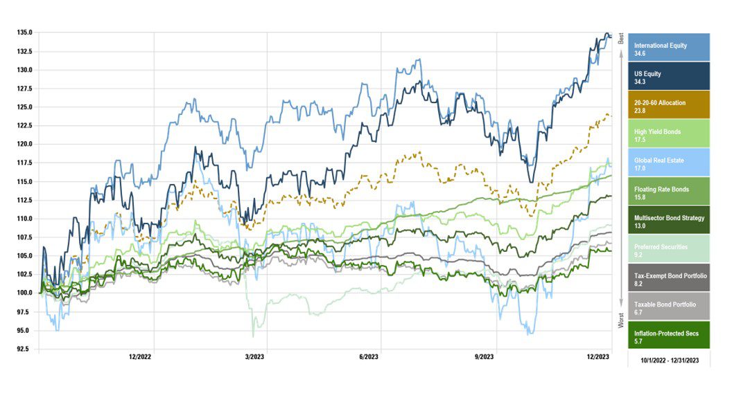
About this Chart:
This chart shows performance for the core market segments within our portfolios since September 30, 2022—the low point for a diversified portfolio in the current market cycle.[2]
Key Takeaways:
- Investor sentiment was decidedly negative this time last year. The Federal Reserve had aggressively hiked interest rates from the zero bound to 4.50% and indicated additional hikes would be necessary to bring inflation down further. In turn, many economists and investors believed it to be a foregone conclusion that a recession would hit by mid-year 2023.
- Had a time traveler told you at the end of last year that the Federal Reserve would go on to increase interest rates to 5.50%, mortgage rates would touch 8%, a regional banking crisis would take down established institutions like Silicon Valley Bank and First Republic, yet we did not see a recession and home prices even ticked higher…would you believe them? Moreover, would you believe the time traveler if they told you global equities would surge more than 30% higher by the end of 2023 alongside positive performance from every segment of the fixed income market despite continued interest rate hikes? To the surprise of many, that is exactly what happened.
- While investors often focus on the surprises that lead to sharp declines (e.g. stickier inflation, higher interest rates), it is important to keep in mind the opposite side of that equation—all the times we are surprised with better-than-expected market outcomes, even when the headlines leave us with plenty to be concerned about.
Lightning Strikes in Q4
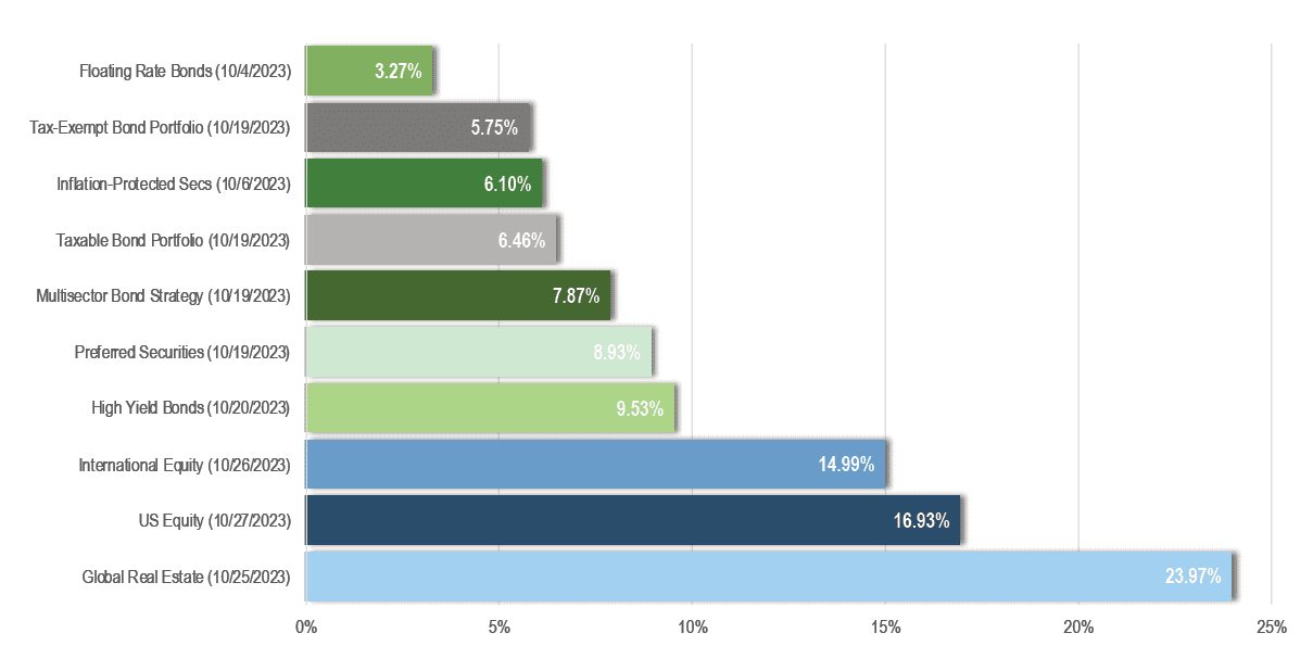
About this Chart:
This chart shows performance of the core market segments within our portfolios since their respective intra-quarter lows in October. [2]
Key Takeaways:
- After logging strong performance through the first two quarters of 2023, markets began to slide from late July through much of October.
- Sentiment turned in October as incoming economic data showed that inflation was coming down quickly, but not at the expense of economic growth and employment.
- This led to a growing consensus for a “soft landing” outcome, where the Federal Reserve would be able to lower interest rates next year while the economy avoids a severe recession.
- Equity and Fixed Income markets rallied sharply in the final two months of the year as investors began to discount the possibility of interest rate cuts against the backdrop of a resilient economy.
Market Expectations for Interest Rate Policy
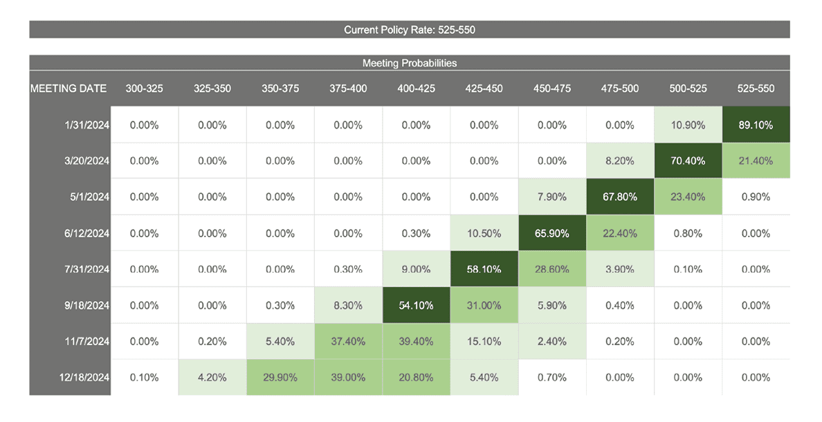
About this Chart:
This chart is a probability distribution table showing where the market believes the Fed Funds rate will be following upcoming Federal Reserve Interest Rate Policy Meetings, the dates of which are listed in the column on the far left. The probabilities listed in the table are all derived from the prices of Fed Funds Futures Contracts that trade throughout the day. The logic behind the calculations is that the current prices of various Fed Funds Futures Contracts only makes sense if these probabilities correctly reflect investor expectations. Of course, this does not mean investors will be right or the future will unfold according to the expectations investors have today. [4]
Key Takeaways:
- The market is pricing in nearly an 80% probability of the first interest rate cut taking place at the Federal Reserve meeting on March 20th, with six total interest rate cuts of 25 basis points taking place through year-end 2024.
- As we look at interest rate expectations further into the year, the dispersion of possible outcomes becomes wider i.e. there is less conviction the further out we look.
- By year end, the market is discounting expectations for the Fed Funds rate to range between 3.5% and 4.25%.
- For investors, the most important question is always “what’s being priced in?” Here, it’s notable that the market is pricing in more rate cuts than Federal Reserve officials have indicated to date.
- The fact that the prevailing market view is different from recent Fed commentary creates the potential for volatility (in both directions) as these two viewpoints become reconciled by incoming economic data.
Interest Rates: US Treasury Yield Curve
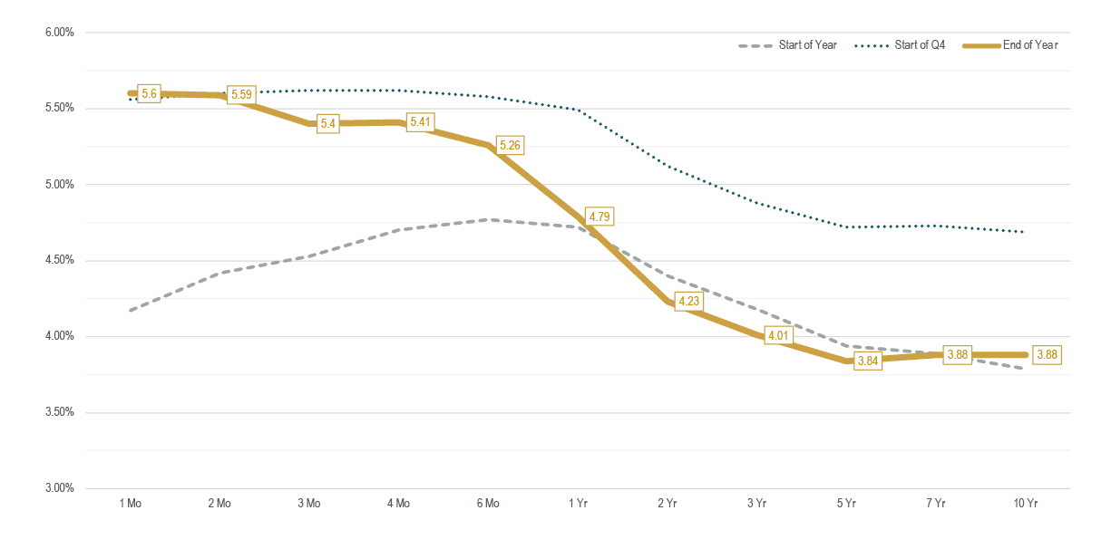
About this Chart:
This chart shows the treasury yield curve as of 12/31/ 2022 (gray dash), 10/1/2023 (blue dot), and 12/31/2023 (solid yellow). [5]
Key Takeaways:
- Over the course of the 2023, the short end of the yield curve moved higher as the Federal Reserve continued to hike interest rates, while yields on maturities of greater than 1 year ended the year close to where they started.
- That said, the long end of the yield curve experienced considerable intra-year volatility. The yield on 10-year treasuries traded in a range between 3.30% and 4.98%.
- The Q4 “everything rally” coincided with a sharp decline in yields, with the 10-year rate falling by more than 1% from its high.
- For the year, the Total Bond Market Index returned 5.7% and the Short-Term Bond Market Index returned 4.9%.
- When short-term treasuries yield more than longer-term treasuries, the yield curve is said to be “inverted.”
- An inverted yield curve can create a predicament for investors as they choose between temporarily higher yields from short-term bonds (until the Federal Reserve cuts the fed funds rate) vs. potentially locking in higher rates for longer.
- In our view, it makes sense to maintain diversified exposure to the yield curve vs. being highly surgical with our exposure. This means some of our fixed income exposure will collect higher yields at the front end of the yield curve, but we’ll also lock in higher yields with a portion of our fixed income allocation, too.
Inflation Trends
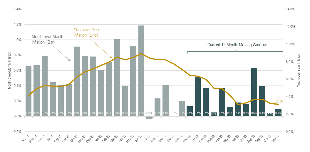
About this Chart:
This chart shows month-over-month inflation (bars, left axis) and year-over-year inflation (line, right axis). Bars shaded in dark blue represent the most recent 12-month period, over which inflation averaged 3.1%, down from 3.7% as of our last quarterly update. [6]
Key Takeaways:
- Inflation trends have been an ongoing concern for consumers and a key driver of investment returns across fixed income and equity markets for the past two years. Consumers and investors alike are anxiously monitoring inflation trends, hoping to see continued progress towards the Federal Reserve’s 2% target rate.
- In identifying emerging trends, it’s helpful to visualize the annual inflation rate as a 12-month moving window, where each month the oldest number drops off and is replaced by a newly revealed number.
- Many economists predicted early in the year that inflation would decline at a rapid pace through June of 2023. This isn’t because they have a crystal ball and knew what the future inflation readings would be. They simply looked at the data and could see that a stretch of large readings in excess of 1% would drop out of the twelve-month moving window starting in March. Hence, predictions saying that inflation would come down was more or less a guess that the monthly numbers dropping out of the twelve-month moving window would be replaced by smaller numbers. Indeed, that is exactly what happened.
- Looking ahead, the numbers dropping out of the 12-month window in January (0.5%) and February (0.4%) offer some potential to see the annual inflation rate drop into the high-2s. Ultimately, this is what’s leading the market to price in the first interest rate cut in March. If inflation stays in the low-3s or moves into the high-2s, monetary policy will become too restrictive if the Fed Funds rate stays at 5.5%.
- It is worth noting that the shelter/housing category represents about 35% of the consumer price index and its most recent year-over-year reading was 6.5%. However, it is widely acknowledged by economists that this component can have a 12-18 month lag, especially around sharp turning points. If the current reading of 6.5% for shelter (which is believed to be based on stale information) was swapped with real time indicators from Zillow, Redfin, and others (e.g. asking rents), year-over-year inflation would register closer to the Fed’s 2% target. But this does not change the fact that the consumer price index, as it is officially calculated, will be slow to reflect quickly moderating inflation for asking rents.
Calibrating Portfolio Positioning
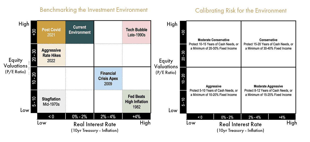
About this Chart:
Historical stock market data reveals there is a strong inverse relationship between starting equity valuations and future equity returns over an intermediate time frame of 10-15 years. When starting valuations are low, future returns tend to be above average, and vice versa. Historical bond market data reveals a strong positive relationship between current yields and future fixed income returns. For example, an investor who buys a 5-year bond yielding 5% can expect to earn very close to 5% per year over the term of the bond (the only unknown component to the nominal return of a fixed income security held to maturity is the future interest rate at which income is assumed to be reinvested). Using this information, we benchmark the current investment environment by deriving absolute return expectations for fixed income and equity markets in isolation as well as relative return expectations between the two asset types (since asset classes are competing against each other for our dollars via expected returns). This exercise helps us determine our portfolio positioning (i.e. the percentage weights of fixed income and equity securities) when equity valuations are high/low and real (inflation-adjusted) interest rates are high/low.
The diagram on the left illustrates how we characterize the investment environment using a quadrant chart with inflation-adjusted treasury yields on the horizontal axis and equity valuations on the vertical axis. Along each axis, we denote the breakpoints used for segmentation; and within each quadrant we identify at least one period that stands out as having historical significance. We then calibrate our allocation positioning according to the quadrant chart on the right. When equity valuations are low (bottom half), we want increased exposure to stocks, all else equal. When real interest rates are high (right half), we want increased exposure to bonds, all else equal. Importantly, we consider allocation adjustments when there are changes in the relative attractiveness of fixed income and equity market segments.
Key Takeaways:
- For the past several years, the investment environment has fallen in the upper left quadrant of our framework. With large movements in fixed income and equity markets, clients might be wondering what we look for when considering adjustments to our investment strategy.
- It is worth emphasizing that allocation adjustments are warranted only when we see large shifts in the relative attractiveness among asset classes as opposed to changes in the absolute expected returns of each asset class in isolation.
- As depicted in the updated visual, we have not categorically shifted into a different investment environment such that a material allocation adjustment would be warranted.
- While we welcome fixed income yields that are considerably more attractive than they have been over the past decade, ~4-5% treasury yields are on par with their long-term average over the past 100 years. In other words, we have seen a return to normal fixed income yields, but not generationally high yields.
- While aggregate valuations for capitalization-weighted indexes such as the S&P 500 and Russell 3000 remain elevated (although down from the peak), a select few mega cap growth companies (e.g. the so-called Magnificent 7) are driving this. Beneath the surface level valuation measurements, there remains healthy return prospects for fundamentally-weighted indexes that overweight companies considered to have low relative prices (i.e. value stocks), high profitability, and lower market capitalizations (i.e. mid and small cap stocks). In other words, we are more constructive on the return potential of our equity portfolio than indexes such as the S&P 500 for the next decade.
- On balance, we continue to believe a moderate conservative stance towards risk in our portfolio positioning is appropriate.
Data Disclosures
[1] Moderate Risk Portfolio: 10% Short-Term Bonds, 10% Intermediate-Term Bonds, 4% Inflation-Protected Bonds, 4% Multisector Bonds, 4% Floating Rate Bonds, 4% High Yield Bonds, 4% Preferred Securities, 34.5% US Stocks, 18% International Stocks, 4.5% Global Real Estate, 3% Master Limited Partnerships. The foregoing information is provided for discussion purposes only and should not be relied upon as indicating any expected or projected returns. Hypothetical back-tested performance does not represent actual performance, trading costs or the impact of taxes and should not be interpreted as an indication of such performance. Data source: Morningstar Direct.
[2] Taxable Bond Portfolio: 50% Vanguard Short-Term Bond Index + 50% Vanguard Total Bond Market. Tax-Exempt Bond Portfolio: 50% Vanguard Limited-Term Tax-Exempt + 50% Vanguard Intermediate-Term Tax Exempt. Inflation-Protected Bonds: Vanguard Inflation-Protected Securities. Multisector Bond Strategy: PIMCO Income. Floating Rate Bonds: Fidelity Floating Rate. High Yield Bonds: PIMCO High Yield. Preferred Securities: Nuveen Preferred Securities. US Equity: DFA US Core Equity I. International Equity: DFA World ex US Core Equity. Global Real Estate: DFA Global Real Estate. Data source: Morningstar Direct.
[3] Source: Morningstar Direct
[4] Source: CME FedWatch Tool
[5] Source: U.S. Treasury
[6] Source: U.S. Bureau of Labor Statistics