Our 2025 Q3 Investment Update
Our third-quarter investment update offers a snapshot of how investments have performed, addresses common client questions, and examines the key themes shaping today’s news and tomorrow’s investment landscape.
Periodic Table of Asset Class Returns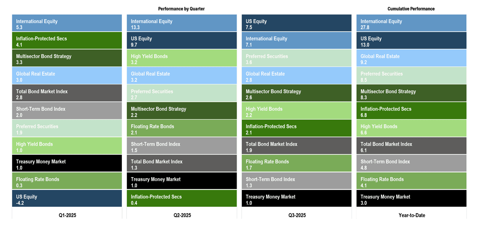
About this Slide: This chart illustrates the performance of core public market segments for the prior three quarters and for the year-to-date period ending September 30, 2025. Each segment is represented by a different color and ranked from highest to lowest return for each period. This information is provided for illustrative purposes only and does not represent the performance of any Brighton Jones client portfolio. Past performance is not indicative of future results.
Key Takeaways: Through the first three quarters of 2025, every market segment posted a positive total return. Notably, cash has been the lowest-performing asset class this year, even against a backdrop of shifting policy in Washington that has created economic uncertainty, standoffs between political parties, and intensifying divisions over social issues.
Following last November’s election, conventional wisdom suggested U.S. stocks would maintain their edge relative to international stocks under a business-friendly administration. Yet markets took a different path: leadership shifted to international equities, which are up nearly 28% so far this year. Roughly a third of that return reflects currency tailwinds, as a weaker dollar has made foreign holdings more valuable in U.S. terms. It’s a reminder that currencies can be a powerful swing factor—helping at times, hurting at others—as the dollar’s decade-plus of strength previously weighed on overseas results.
From time to time, we share a chart showing calendar-year returns alongside the largest intra-year declines for the U.S. stock market. The experience of 2025 fits that story perfectly: despite a 20% drop earlier in the year, the U.S. stock market today sits 13% higher year-to-date. It’s a reminder that volatility and setbacks are a normal part of investing, and that keeping a long-term perspective is essential.
Despite stubborn inflation and volatile interest rate movements, the fixed income market has delivered strong results year-to-date. The total bond market is up more than 6%, while riskier segments of the credit market have added an additional 1–2% of return. Floating-rate bonds have been the exception, weighed down by falling short-term interest rates—but still providing more than a 4% return.
Overall, 2025 has been marked by resilience: equities have pushed higher despite episodes of volatility, international leadership has emerged after years of U.S. dominance, and fixed income has delivered strong positive returns as investors balance the implications of stubborn inflation and weakening employment numbers on the Federal Reserve’s interest rate policy.
Data Disclosures: Treasury Money Market: Fidelity Treasury Money Market. Short-Term Bond Index: Vanguard Short-Term Bond Index. Total Bond Market Index: Vanguard Total Bond Market Index. Inflation-Protected Treasuries: Vanguard Inflation-Protected Securities. Multisector Bond Strategy: PIMCO Income. Floating Rate Bonds: Fidelity Floating Rate. High Yield Bonds: PIMCO High Yield. Preferred Securities: Nuveen Preferred Securities. US Stocks: DFA US Core Equity I. Foreign Stocks: DFA World ex US Core Equity. Global Real Estate: DFA Global Real Estate. Data source: Morningstar Direct.
Lightning Strikes: Returns From April 8th Low
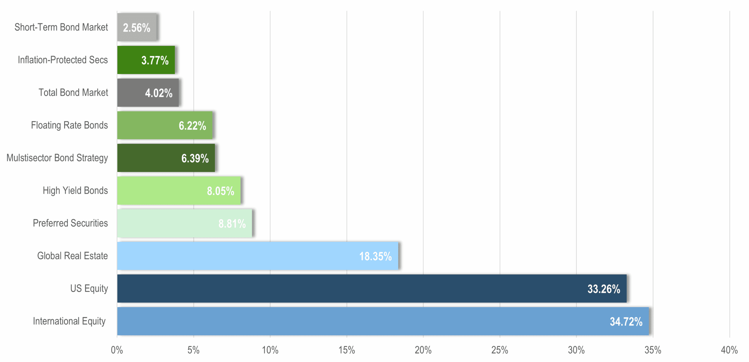
About this Slide: This chart shows performance of the core public market segments since the stock market low on April 8th. This information is provided for illustrative purposes only and does not represent the performance of any Brighton Jones client portfolio. Past performance is not indicative of future results.
Key Takeaways: On April 2nd—what came to be known as Liberation Day—President Trump unveiled his long-awaited tariff plan. Most observers had been bracing for modest tariffs of around 10%, but markets were stunned when the announced measures were far more sweeping. The surprise sent shockwaves through global markets, sparking panic selling as investors recalibrated the potential impact on trade, supply chains, and corporate earnings. Equity markets plunged in the days that followed, ultimately bottoming on April 8th before beginning a powerful rebound.
On April 9th, President Trump announced a 90-day pause on the newly implemented tariffs, giving each country an opportunity to negotiate a trade deal before higher rates would take effect. The news sent markets rocketing higher. By early May, equities had fully recovered from the selloff resulting from the April 2nd tariff plan, and by June, markets were once again setting new all-time highs.
The sheer speed of the rebound reinforces the timeless lesson that ‘you have to be there when lightning strikes.’ Moving to cash when the skies seem darkest can feel safe in the moment, but it risks missing the very rallies that drive long-term returns.
Data Disclosures: Treasury Money Market: Fidelity Treasury Money Market. Short-Term Bond Index: Vanguard Short-Term Bond Index. Total Bond Market Index: Vanguard Total Bond Market Index. Inflation-Protected Treasuries: Vanguard Inflation-Protected Securities. Multisector Bond Strategy: PIMCO Income. Floating Rate Bonds: Fidelity Floating Rate. High Yield Bonds: PIMCO High Yield. Preferred Securities: Nuveen Preferred Securities. US Stocks: DFA US Core Equity I. Foreign Stocks: DFA World ex US Core Equity. Global Real Estate: DFA Global Real Estate. Data source: Morningstar Direct.
US Dollar Index
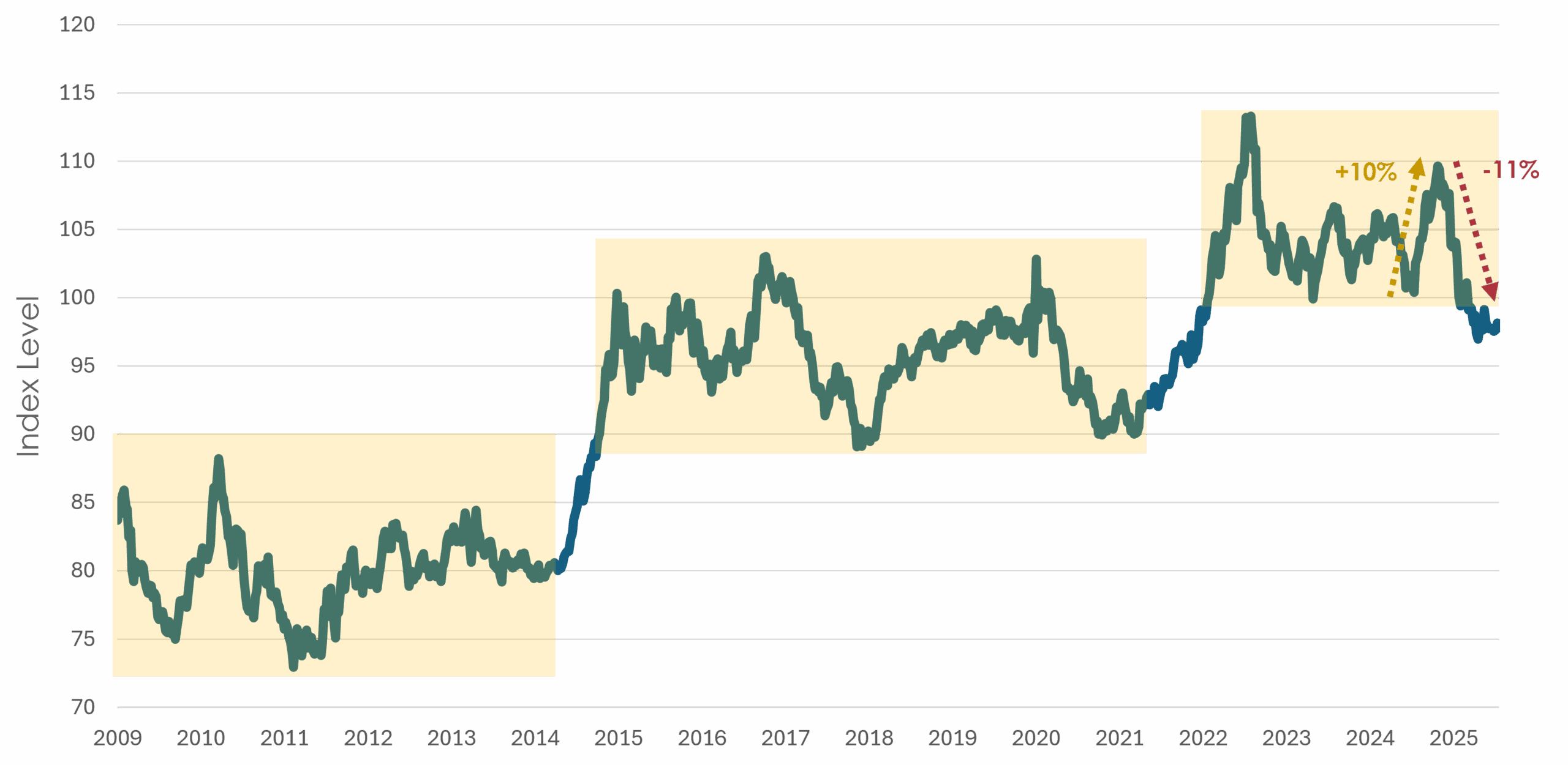
About this Chart: This chart shows the U.S. Dollar Index (DXY) since the end of the global financial crisis. The index represents a weighted average value of the dollar against select currencies, including the euro, Japanese yen, British pound sterling, Canadian dollar, Swedish krona, and Swiss franc. Past performance is not indicative of future results.
Key Takeaways: While many headlines have focused on the U.S. dollar’s ~11% decline since January—prompting questions about whether to shift assets into foreign currencies—it’s important to zoom out for context. After last November’s presidential election, the dollar index surged nearly 10% through early January, only to give back those gains in the months that followed. Today, the dollar index sits slightly below its pre-election level. Stepping further back, the dollar has spent the past three years oscillating within a 100–120 range, peaking in 2022 at the onset of the war in Ukraine. Looking back fifteen years, a broader pattern emerges: the dollar tends to consolidate for long periods within a 20% band until a catalyst pushes it into a new range. Over that time, the prevailing trend has been upward.
Our goal is to design portfolios that don’t rely on predicting currency moves. By diversifying across U.S. and international markets, we create balance so that currency swings are just one factor among many rather than the primary driver of outcomes. This year, international holdings have benefited from currency tailwinds, boosting returns, while U.S. investments have also delivered strong performance. Together, the combination reinforces the value of global diversification.
Data Disclosures: Source: Investing.com
Interest Rates: US Treasury Yield Curve
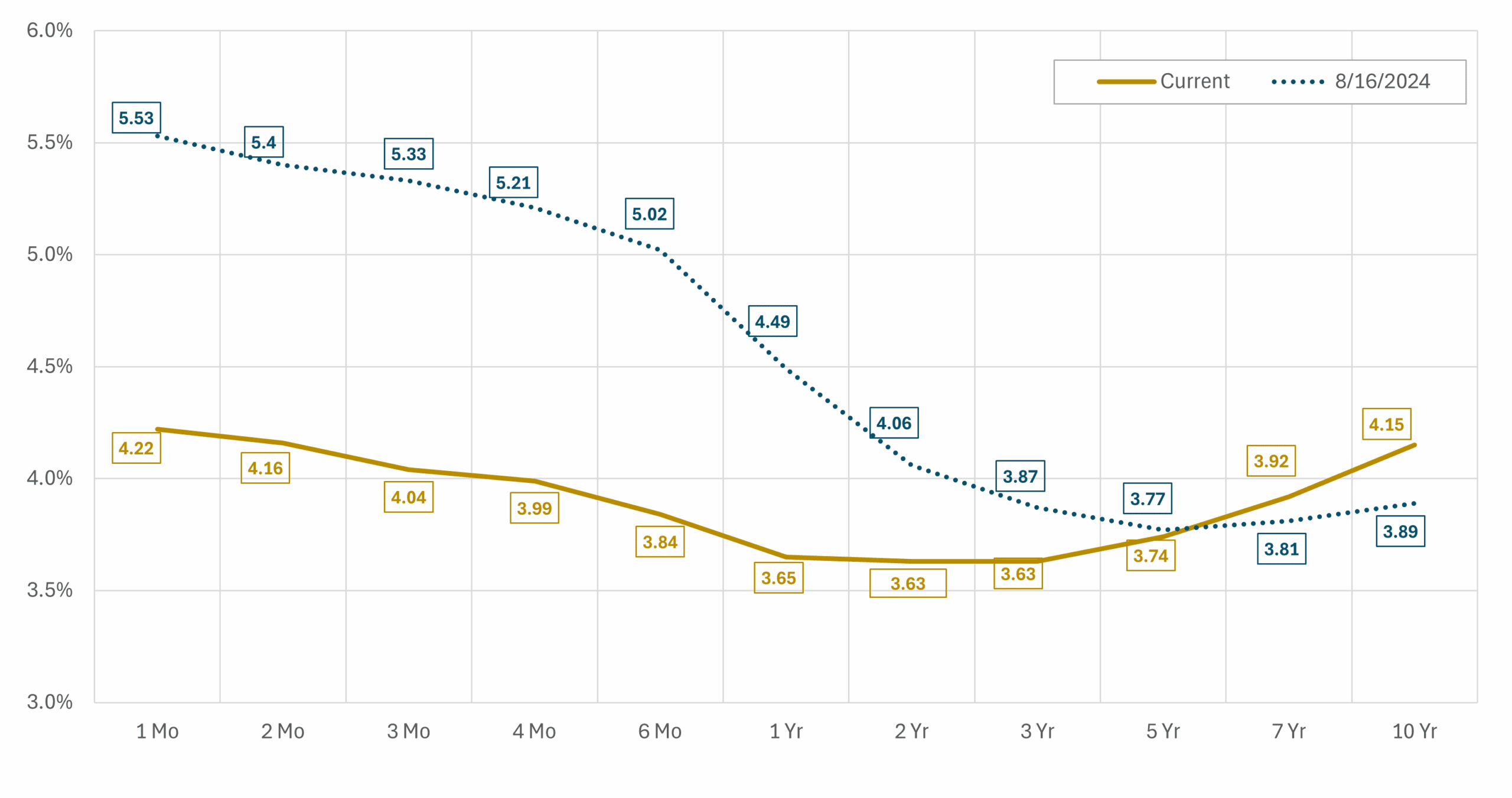
About this Chart: This chart shows the treasury yield curve as of 8/16/2024—one month before the first interest rate cut of the current cycle—and 9/30/2025.
Key Takeaways: In the current interest rate cycle, the Federal Reserve has taken the following actions:
- September 18, 2024 — cut by 50 basis points to 4.75 % – 5.00 %.
- November 7, 2024 — cut by 25 basis points to 4.50 % – 4.75 %.
- December 18, 2024 — cut by 25 basis points to 4.25 % – 4.50 %.
- September 17, 2025 — cut by 25 basis points to 4.00 % – 4.25 %.
In total, the Federal Reserve has reduced the Fed Funds target rate by 125 basis points over the past year. Yet yields on Treasury securities with maturities beyond five years have risen modestly, reflecting concerns that inflation may prove stubborn and that policy easing will not bring a return to the ultra-low rate environment of the past decade.
The yield curve is considered ‘inverted’ when short-term Treasuries pay more than long-term Treasuries—a rare setup that often reflects recession fears. Over the past year, as the Fed has begun to cut interest rates, the curve has been steadily moving back toward normal, with short-term yields easing and long-term yields staying elevated.
While investors have benefited from unusually high returns on cash in recent years, the yield curve is now relatively flat and moving toward normalization. This creates stronger incentives to move beyond cash and extend maturities, capturing attractive income opportunities across the bond market.
Data Disclosures: Source: US Treasury
Market Expectations for Interest Rate Policy
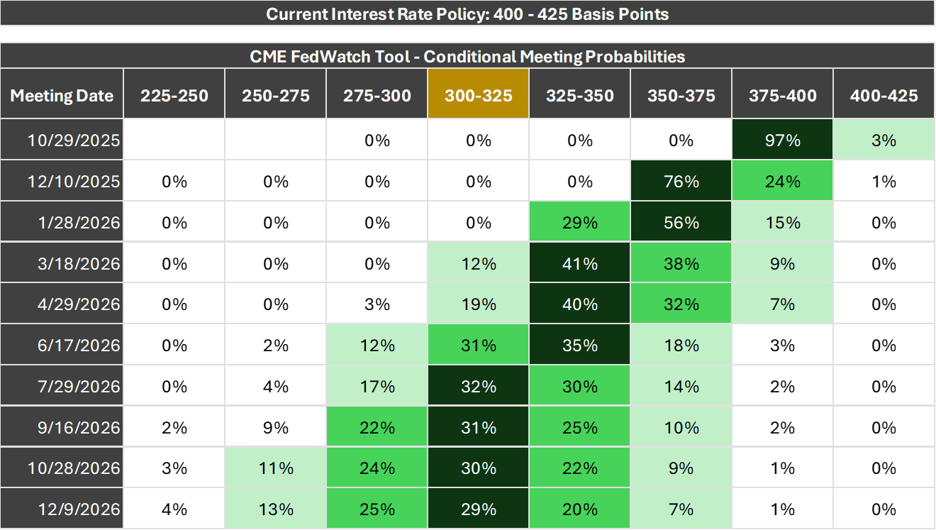
About this Slide: This chart is a probability distribution table showing where the market believes the Fed Funds rate will be following upcoming Federal Reserve Interest Rate Policy Meetings, the dates of which are listed in the column on the far left. The probabilities listed in the table are all derived from the prices of Fed Funds Futures Contracts that trade throughout the day. The logic behind the calculations is that the current prices of various Fed Funds Futures Contracts only makes sense if these probabilities correctly reflect investor expectations. Of course, this does not mean investors will be right or the future will unfold according to the expectations investors have today.
Key Takeaway: The market is currently pricing in near certainty of another 25-basis-point rate cut at the Federal Reserve’s October meeting, along with a 76% probability of a third cut before year-end at the December meeting. Looking ahead to 2026, the market anticipates two more rate cuts, taking the Fed Funds rate to 300-325 basis points by mid-year. That range lines up with what Fed officials have repeatedly referred to as the ‘neutral rate’—a steady-state level that is intended to balance growth and inflation without acting as either a brake or an accelerator.
Data Disclosures: Source: CME FedWatch Tool
Inflation Trends
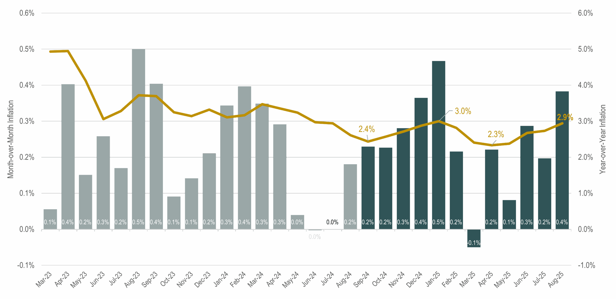
About this Slide: This chart shows month-over-month inflation (bars, left axis) and year-over-year inflation (line, right axis). Bars shaded in dark blue represent the most recent 12-month period, over which inflation averaged 2.9%.
Key Takeaways: Elevated inflation has been an ongoing concern for consumers and a key driver of investment returns across both fixed income and equity markets since 2022. Understandably, consumers and investors alike continue to monitor inflation trends closely, hoping for evidence that price pressures will keep easing. The Federal Reserve has made significant progress: inflation has fallen from a peak of 9% in June 2022 to just under 3% in the most recent readings.
Headlines typically focus on year-over-year inflation but looking at monthly inflation readings can reveal potential trends sooner. In identifying emerging trends, it’s helpful to visualize the annual inflation rate as a 12-month moving window, where each month the oldest number drops off and is replaced by a newly revealed number.
Some economists have predicted that inflation may tick higher in the final three months of the year before easing again in early 2026. This isn’t because they have a crystal ball—it’s simply a matter of math. When economists see that lower numbers are set to roll out of the 12-month window, they anticipate that reported inflation may rise; when larger numbers are about to drop out, they forecast that inflation is likely to fall. In other words, many inflation forecasts are less about clairvoyance and more about recognizing which monthly figures will move in or out of the rolling calculation—and we already know half of that equation in advance.
Data Disclosures: Source: U.S. Bureau of Labor Statistics
S&P 500 Return from 30 Days before to 30 days after a Government Shutdown
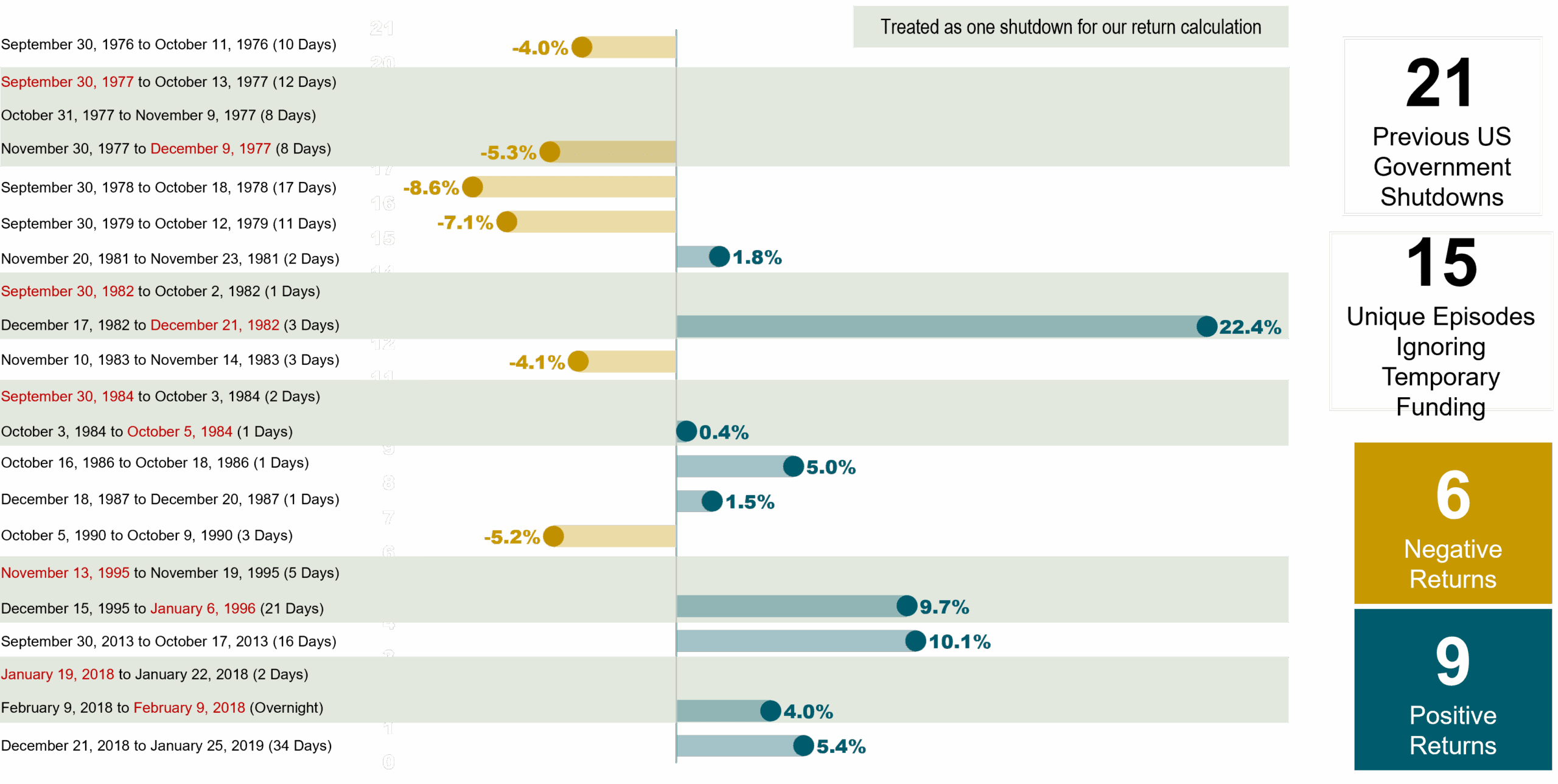
About this Slide: Some clients have asked whether we should reposition portfolios due to the government shutdown. This slide identifies dates of previous government shutdowns and shows the price return of the S&P 500 Index spanning 30 days before each shutdown started to 30 days after each shutdown ended. In cases where temporary funding agreements briefly restored government operations before shutting down again, we calculated the return from 30 days before the first shutdown to 30 days after the last shutdown.
Key Takeaways: While news headlines might paint a scary picture of the potential ramifications of a government shutdown, history reveals no clear relationship between shutdowns and stock market returns. From an investment standpoint, this isn’t a high conviction event that should influence changes to one’s portfolio or investment strategy.
It’s also worth clarifying what happens during a government shutdown:
- A shutdown occurs when the federal government suspends services deemed non-essential because a new law to fund discretionary spending programs was not approved ahead of a fiscal year deadline.
- When agreement on a new funding bill is not reached, Congress may pass a “continuing resolution” that extends previous funding levels to keep the government fully operating.
- Past government shutdowns paused nonessential activities in various government departments—for example, national parks and museums have closed. Critical federal government functions such as ongoing Social Security benefits, air traffic controllers, and the Postal Service generally were not affected.
- Federal government shutdowns don’t affect state and local government functions that are not dependent on federal funding.
Note: we assessed return calculations in more ways than one. For example, we also calculated market returns only during the period in which the government was closed. These variations of return calculations do not change the overarching conclusion: government shutdowns are not a tradeable event.
Data Disclosures: Data source: Morningstar Direct
Calibrating Portfolio Positioning
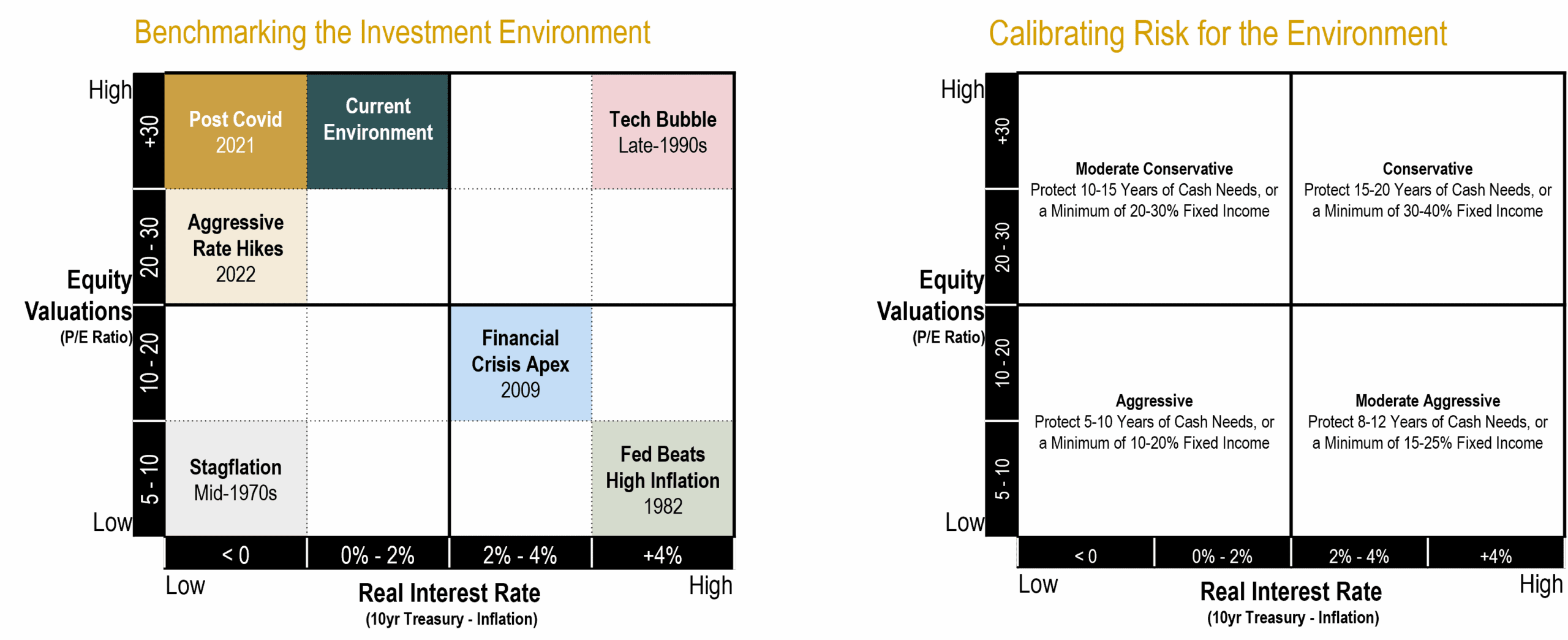
About this Slide: Historical stock market data reveals there is a strong inverse relationship between starting equity valuations and future equity returns over an intermediate time frame of 10-15 years. When starting valuations are low, future returns tend to be above average, and vice versa. Historical bond market data reveals a strong positive relationship between current yields and future fixed income returns. For example, an investor who buys a 5-year bond yielding 5% can expect to earn very close to 5% per year over the term of the bond (the only unknown component to the nominal return of a fixed income security held to maturity is the future interest rate at which income is assumed to be reinvested). Using this information, we benchmark the current investment environment by deriving absolute return expectations for fixed income and equity markets in isolation as well as relative return expectations between the two asset types (since asset classes are competing against each other for our dollars via expected returns). This exercise helps us determine our portfolio positioning (i.e. the percentage weights of fixed income and equity securities) when equity valuations are high/low and real (inflation-adjusted) interest rates are high/low.
The diagram on the left illustrates how we characterize the investment environment using a quadrant chart with inflation-adjusted treasury yields on the horizontal axis and equity valuations on the vertical axis. Along each axis, we denote the breakpoints used for segmentation; and within each quadrant we identify at least one period that stands out as having historical significance. We then calibrate our allocation positioning according to the quadrant chart on the right. When equity valuations are low (bottom half), we want increased exposure to stocks, all else equal. When real interest rates are high (right half), we want increased exposure to bonds, all else equal. Importantly, we consider allocation adjustments when there are changes in the relative attractiveness of fixed income and equity market segments.
Key Takeaways: For the past several years, the investment environment has fallen in the upper left quadrant of our framework. With large movements in fixed income and equity markets, clients might be wondering what we look for when considering adjustments to our investment strategy.
It is worth emphasizing that model adjustments are warranted only when we see large shifts in the relative attractiveness among asset classes as opposed to changes in the absolute expected returns of each asset class in isolation.
While aggregate valuations for capitalization-weighted indexes such as the S&P 500 and Russell 3000 remain elevated (although down from the peak), a select few mega cap growth companies (e.g. the Magnificent 7) are driving this. Beneath the surface level valuation measurements, there remains healthy return prospects for fundamentally-weighted indexes that overweight companies considered to have low relative prices (i.e. value stocks), high profitability, and lower market capitalizations (i.e. mid and small cap stocks). In other words, we are more constructive on the return potential of our globally diversified equity portfolio than indexes such as the S&P 500 for the next decade.
On balance, we continue to believe a moderate conservative stance towards risk in our portfolio positioning is appropriate.
Disclosure: This content is for informational and educational purposes only and should not be construed as individualized advice. For individualized advice tailored to your specific circumstances, please consult with your adviser.
Please remember that past performance may not be indicative of future results. Different types of investments involve varying degrees of risk, and there can be no assurance that the future performance of any specific investment, investment strategy, or product (including the investments and/or investment strategies recommended or undertaken by Brighton Jones, LLC), or any non-investment related content, made reference to directly or indirectly on this website will be profitable, equal any corresponding indicated historical performance level(s), be suitable for your portfolio or individual situation, or prove successful. Due to various factors, including changing market conditions and/or applicable laws, this content may no longer be reflective of current opinions or positions. Moreover, you should not assume that any discussion or information contained on this website serves as the receipt of, or as a substitute for, personalized investment advice from Brighton Jones, LLC. To the extent that you have any questions regarding the applicability of any specific issue discussed above to your individual situation, you are encouraged to consult with a professional advisor of your choosing. Brighton Jones, LLC is neither a law firm nor a certified public accounting firm, and no portion of this content should be construed as legal or accounting advice. A copy of our current written disclosure statement discussing our advisory services and fees continues to remain available upon request.