

Our 2026 Q2 Investment Update
Our second-quarter investment update offers a snapshot of how investments have performed, addresses common client questions, and examines the key themes shaping today’s news and tomorrow’s investment landscape.
Periodic Table of Asset Class Returns
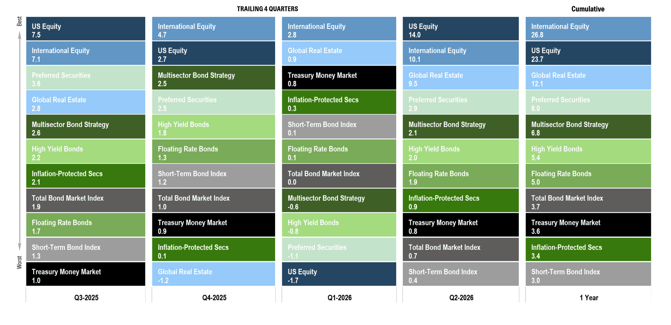
About this chart: This chart illustrates the performance of core public market segments for the prior four quarters and for the trailing one-year period. Each segment is represented by a different color and ranked from highest to lowest return for each period. This information is provided for illustrative purposes only and does not represent the performance of any Brighton Jones client portfolio. Past performance is not indicative of future results.
Key takeaways:
Looking at the trailing one-year returns from Q3-2025 through Q2-2026, it is worth pausing on what investors actually had to live through to earn those results. Positive returns rarely come in a straight line, and this stretch was no exception. Investors entered the period still recovering from the Liberation Day tariff selloff of April 2025, which had sent the U.S. stock market down nearly 20% and produced no shortage of unsettling headlines. Then, in late February of this year, joint U.S. and Israeli military strikes on Iran and the effective closure of the Strait of Hormuz introduced a fresh wave of uncertainty. Brent crude roughly doubled, climbing from $61 per barrel at the start of the year to nearly $120 at its peak. The 10-year Treasury yield rose from around 4.0% to nearly 4.5%, inflation accelerated to 4.2%, its highest level in three years, and gold fell sharply from January’s record high, posting its worst quarter in more than a decade.
And yet, despite that backdrop, every asset class shown on this chart delivered a positive return over the past twelve months. International equity gained approximately 27%, U.S. equity gained nearly 24%, and credit-oriented bond sectors delivered healthy premiums over cash. Perhaps most surprising of all, U.S. stocks posted their best quarter since the post-pandemic rebound of 2020, and it arrived in the middle of a war, an oil shock, and renewed talk of Fed rate hikes rather than cuts. That is often how investing works in real life. The path can feel uncomfortable in the moment, even when the longer-term outcome ends up being favorable. The investors best served over the past year were the ones who didn’t let the headlines make their decisions.
Data Disclosures: Treasury Money Market: Fidelity Treasury Money Market. Short-Term Bond Index: Vanguard Short-Term Bond Index. Total Bond Market Index: Vanguard Total Bond Market Index. Inflation-Protected Treasuries: Vanguard Inflation-Protected Securities. Multisector Bond Strategy: PIMCO Income. Floating Rate Bonds: Fidelity Floating Rate. High Yield Bonds: PIMCO High Yield. Preferred Securities: Nuveen Preferred Securities. U.S. Stocks: DFA US Core Equity I. Foreign Stocks: DFA World ex US Core Equity. Global Real Estate: DFA Global Real Estate. Data source: Morningstar Direct. The listed funds are used as market proxies for illustrative purposes only. Returns do not reflect the deduction of Brighton Jones advisory fees, transaction costs, taxes, or other expenses that would reduce returns.
US Dollar Index
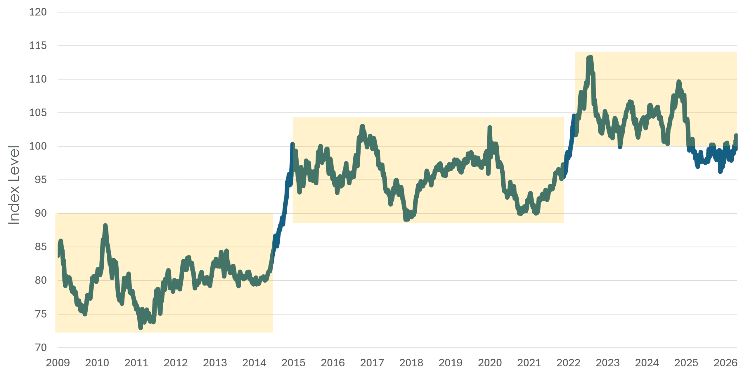
About this chart: This chart shows the U.S. Dollar Index (DXY) since the end of the global financial crisis. The index represents a weighted average value of the dollar against select currencies, including the euro, Japanese yen, British pound sterling, Canadian dollar, Swedish krona, and Swiss franc. Past performance is not indicative of future results.
Key Takeaways:
Last year and heading into this year, the dollar’s decline of nearly 10% in 2025 led many investors to declare that the dollar’s long bull run had ended. Our view at the time was that the move needed context: in the weeks following the 2024 presidential election, the dollar had surged by a similar amount, and the 2025 decline largely amounted to giving back that post-election gain. Viewed together, the round trip left the dollar roughly where it had traded for the prior three years. In our view, it was too early to make that call.
That said, the weakness was not trivial. The dollar index fell below 100, a psychologically important level that had also served as the lower bound of its trading range since 2022, and touched a four-year low in February. The bearish chorus grew louder, and many questioned whether portfolios should tilt more meaningfully toward foreign assets or alternatives such as gold.
Then the conflict in the Middle East disrupted that narrative, and not in the way conventional wisdom would have predicted. Gold, an asset believed to be a safe haven in times of geopolitical stress, instead suffered a peak-to-trough decline of nearly 30%, and the dollar index quickly reclaimed 100. Several explanations have been cited, and they illustrate how markets can defy intuition. First, the oil shock reignited inflation, which shifted Federal Reserve expectations from rate cuts toward rate hikes. Higher yields simultaneously strengthened the dollar and undermined the appeal of an asset that pays no income. Second, and less obvious, the closure of the Strait of Hormuz halted oil shipments from the region, and with them the export revenues that had funded heavy gold accumulation by Middle Eastern buyers in recent years. Even as prices doubled, producers who could not ship could not sell, removing a key source of gold demand at precisely the moment conventional wisdom expected it to rally.
That reversal is a useful reminder of why we are cautious about acting on currency forecasts. Inflection points can happen quickly, the catalysts are inherently unpredictable, and even when the catalyst arrives, markets do not always respond the way intuition suggests. The cost of positioning too aggressively around a single macro view can be meaningful.
Looking at the longer history in this chart, a pattern emerges. Over the past fifteen years, the dollar has often spent years consolidating within a broad range, then broken to a new level when a sufficiently strong catalyst emerged. It happened in 2014 and again in 2022. Where the dollar goes from here will depend on variables such as geopolitics, Federal Reserve policy, and global capital flows, none of which can be forecast with enough precision to anchor portfolio decisions confidently.
Our goal is to build portfolios that do not depend on getting the next move in the dollar right. By diversifying across U.S. and international markets, currency fluctuations become part of the investment landscape rather than the primary driver of success or failure.
Data Disclosures: Source: Investing.com
Interest Rates: US Treasury Yield Curve
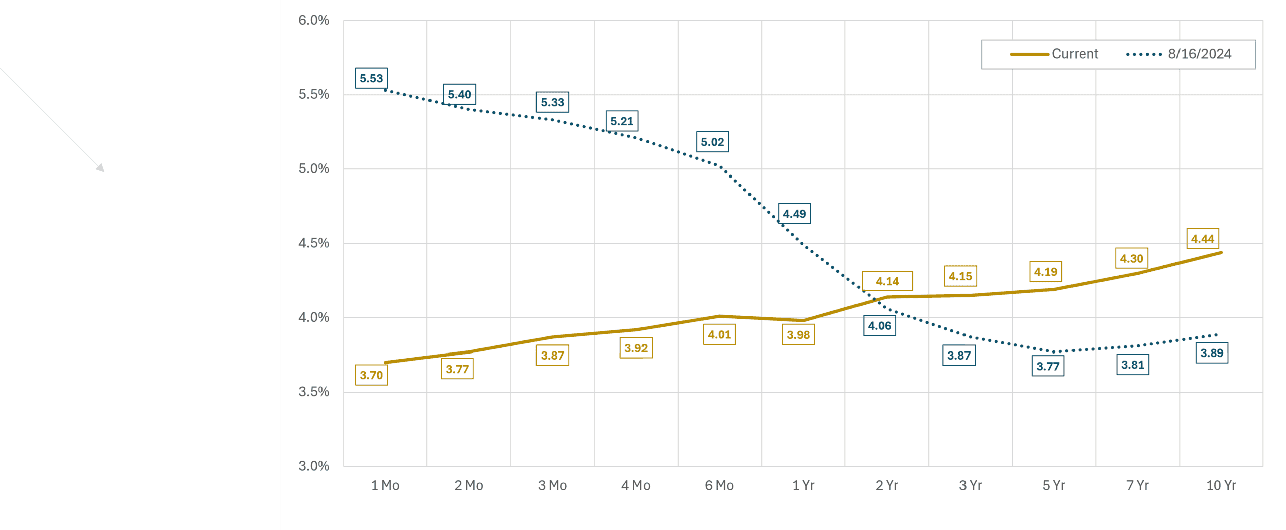
About this Chart: This chart shows the Treasury yield curve as of 8/16/2024—one month before the first interest rate cut of the current cycle—and 6/30/2026.
Key Takeaways:
In the current interest rate cycle, the Federal Reserve has taken the following actions:
- September 18, 2024 — cut by 50 basis points to 4.75%–5.00%
- November 7, 2024 — cut by 25 basis points to 4.50%–4.75%
- December 18, 2024 — cut by 25 basis points to 4.25%–4.50%
- September 17, 2025 — cut by 25 basis points to 4.00%–4.25%
- October 29, 2025 — cut by 25 basis points to 3.75%–4.00%
- December 10, 2025 — cut by 25 basis points to 3.50%–3.75%
In total, the Federal Reserve has reduced its target rate by 175 basis points since September 2024. Yet yields on Treasuries with maturities beyond two years have moved in the opposite direction, rising even as the Fed cut. Part of this reflects a market that no longer expects a return to the ultra-low rate environment of the past decade. More recently, the inflation shock from the Middle East conflict pushed consumer prices back above 4% and shifted market expectations from further rate cuts toward potential rate hikes. The Fed has held rates steady throughout 2026 as a result.
The yield curve is considered inverted when short-term Treasuries pay more than long-term Treasuries, an unusual setup that often reflects expectations of falling rates and slowing growth. That was the picture in August 2024, when one-month bills yielded 5.53% and the 10-year yielded just 3.89%. Two years later, the curve has returned to its normal upward slope: short-term yields have followed the Fed’s cuts lower, while long-term yields have risen.
Our general investment philosophy through this entire cycle has not changed. Rather than making surgical bets on any single point of the curve, we maintain broad exposure across the full range of maturities. The logic is simple. If rates fall, a portion of the portfolio is already locked into today’s higher yields. If rates rise, maturing bonds are reinvested at those higher rates. No single scenario is a win or a loss for the whole portfolio, which is precisely the point. The past two years illustrate why: investors who concentrated in cash when it briefly paid the most have since watched those yields reset lower with each Fed cut, while forecasters calling for lower long-term rates were surprised in the other direction. We would rather be approximately right across every environment than precisely wrong in one.
Disclaimer: Fixed income investments are subject to interest-rate risk, credit risk, reinvestment risk, and inflation risk. Longer-duration bonds may decline in value when interest rates rise, while lower-quality bonds may be more sensitive to credit conditions.
Data Disclosures: Source: US Treasury
Market Expectations for Interest Rate Policy
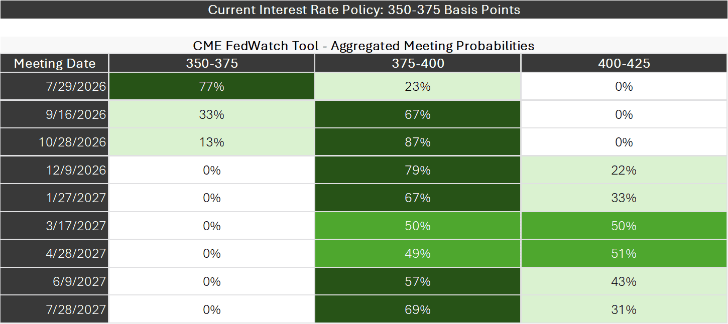
About this chart: This chart is a probability distribution table showing where the market believes the Fed Funds rate will be following upcoming Federal Reserve Interest Rate Policy Meetings, the dates of which are listed in the column on the far left. The probabilities listed in the table are all derived from the prices of Fed Funds Futures Contracts that trade throughout the day. The logic behind the calculations is that the current prices of various Fed Funds Futures Contracts only makes sense if these probabilities correctly reflect investor expectations. Of course, this does not mean investors will be right or the future will unfold according to the expectations investors have today.
Key takeaways:
Prior to the escalating military action in the Middle East, futures markets had been pricing in roughly two interest rate cuts over the course of 2026. The assumption was straightforward: slowing growth and a cooling labor market would give the Federal Reserve room to ease. That expectation abruptly disappeared as markets repriced in the weeks following the late-February strikes.
As of quarter end, markets had abandoned all expectations of additional rate cuts and moved decisively in the other direction, something that would have seemed highly unlikely at the start of the year. The table shows the market’s base case: one rate hike is nearly fully priced by this fall, and the odds of a second hike by next spring sit at roughly a coin flip.
The driver is not complicated. Surging oil prices reignited inflation, which reached 4.2% in May, and the Fed cannot cut rates into a fresh inflationary shock without risking its credibility. The Fed’s own June projections point the same direction, with roughly half of officials now expecting at least one hike by year end.
The shift in tone also coincides with a change in leadership. Kevin Warsh succeeded Jerome Powell as Fed Chair in May, and at his first meeting in June the committee removed language pointing toward future easing and emphasized what Warsh called a “unanimous and unambiguous” commitment to price stability. At the same time, officials have acknowledged the competing risk: if higher energy costs slow the labor market and squeeze consumer spending, the calculus could shift again. The Fed is watching inflation on one side and growth on the other, and the situation is evolving quickly enough that rate expectations have moved meaningfully from week to week.
One nuance in the table is worth noting. The probabilities suggest the market views this as a brief adjustment rather than a prolonged tightening cycle. Expectations for a second hike peak next spring and then recede in the later meetings, implying investors believe the inflation shock will prove temporary as energy prices stabilize.
For investors, the practical message is that the rate environment remains genuinely uncertain in a way that makes forecasting difficult. Six months ago, the consensus called for cuts; today it calls for hikes; six months from now it may say something else entirely. What has not changed is our view that maintaining diversified fixed income exposure, and avoiding the temptation to time rate moves, remains the right posture.
Disclaimer: Fed Funds futures are market-based estimates and should not be viewed as predictions or guarantees of future Federal Reserve actions. Market-implied probabilities can change quickly.
Data Disclosures: Source: CME FedWatch Tool
Inflation Trends
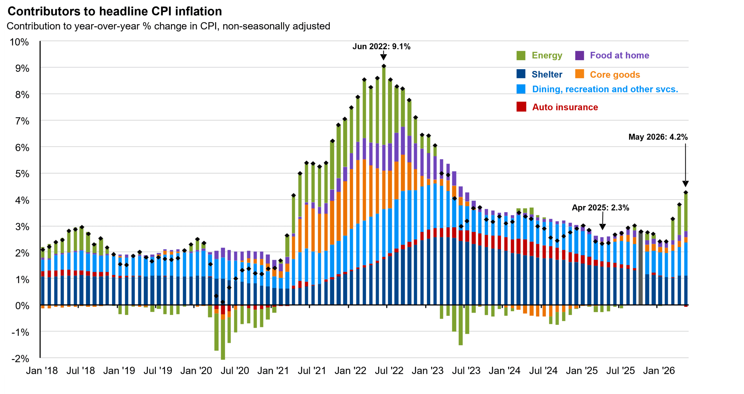
About this Slide: This chart breaks down U.S. consumer price inflation by component, providing a clear view of what has been driving inflation in recent years. Headline inflation peaked in June 2022 amid the Ukraine/Russia war and post-pandemic supply disruptions, then moderated over the following three years before re-accelerating in 2026 as the Middle East conflict pushed energy prices sharply higher.
Key takeaways:
Elevated inflation has been an ongoing concern for consumers and a key driver of investment returns across both fixed income and equity markets since 2022. The chart tells that story in three chapters.
The first chapter was the surge: headline CPI peaked at 9.1% in June 2022, driven by a broad combination of energy prices, supply chain-driven goods inflation, and shelter costs that proved slow to unwind. The second was the long journey back down, which took nearly three years and bottomed at 2.3% in April 2025. Even then, inflation showed signs of stubbornness beneath the calm headline. Services prices remained sticky, tariff pass-through was appearing in select categories, and readings drifted closer to 3% than 2% through the remainder of the year.
The third chapter began with the late-February strikes in the Middle East, which sent oil prices sharply higher. The effect on consumer prices was fast: headline CPI accelerated to 4.2% by May, its highest level in three years. This is the source of the shift in Federal Reserve policy expectations described on the prior slide.
The composition of the current spike matters as much as the level. Unlike 2022, when price pressures were broad and touched nearly every category, the recent acceleration is narrowly concentrated in energy, visible as the green bars reappearing at the top of the chart. The categories beneath it have not meaningfully deteriorated. That distinction is central to the debate over what comes next: if energy prices stabilize as the conflict de-escalates, the spike could fade from the data within a year, which is why markets expect only a brief Fed response rather than a prolonged tightening cycle. The risk is that elevated energy costs persist long enough to seep into the stickier categories, such as services and wages, converting a supply shock into something more durable. That is the outcome the Federal Reserve is determined to prevent.
Notably, oil prices have already given back the entire conflict-driven spike. As of early July, Brent crude traded near $72 per barrel, back to its pre-strike level after drifting up from $61 at the start of the year, as shipping through the Strait of Hormuz recovered and OPEC+ moved to increase supply. If prices hold near these levels, the energy contribution visible at the right edge of this chart should begin to fade from the inflation data in the quarters ahead, though the situation in the region remains fluid.
Data Disclosures: Source: U.S. Bureau of Labor Statistics, JP Morgan
Calibrating Portfolio Positioning
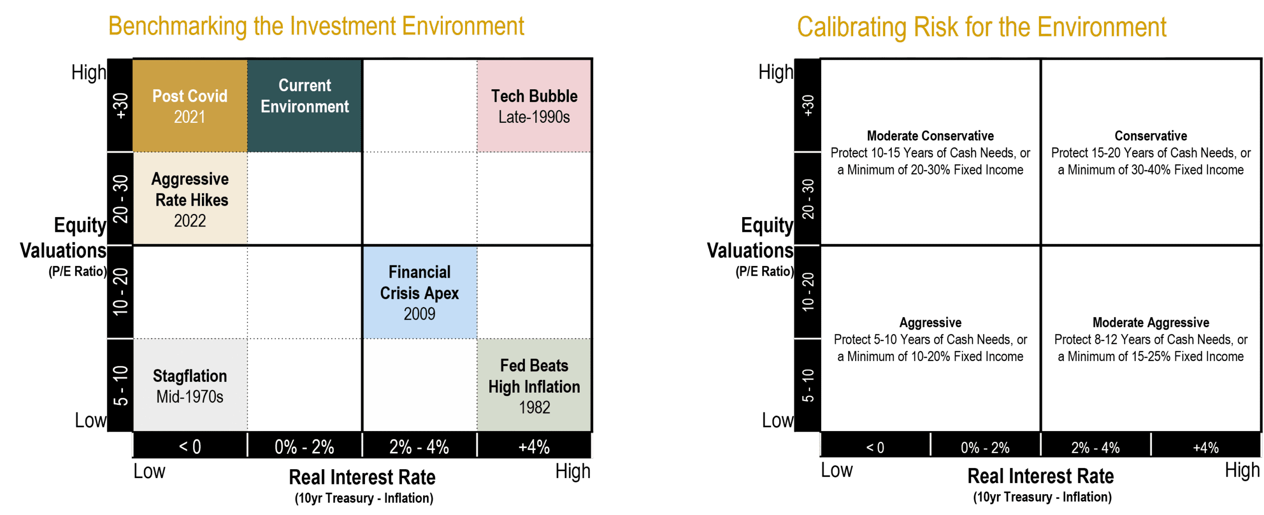
About this Slide: This slide presents the framework we use to calibrate portfolio positioning based on the relative attractiveness of stocks and bonds. The two primary inputs are equity valuations and real interest rates. The chart on the left shows how we classify the investment environment using these two variables. The chart on the right shows the broad portfolio posture that would typically align with each environment. Lower valuations generally make equities more attractive. Higher real yields generally make fixed income more attractive.
Key Takeaways:
Historically, starting equity valuations have shown an inverse relationship with long-term future equity returns: lower starting valuations have generally led to better forward returns, while higher starting valuations have generally led to lower forward returns. In fixed income, starting yields exhibit a strong positive relationship with future returns, especially for bonds held to maturity or over a meaningful portion of their term.
This framework is meant to guide judgment, not drive mechanical changes. We consider portfolio adjustments only when the relative tradeoff between stocks and bonds shifts meaningfully, not simply when the absolute return outlook for each asset class changes on its own. Higher bond yields and lower equity valuations do not automatically call for a repositioning if both asset classes have improved by a similar degree.
For the past several years, the environment has generally fallen in the upper-left portion of the framework: elevated equity valuations alongside low-to-moderate real interest rates. That argues for a moderate risk posture with a meaningful allocation to fixed income across both high-quality and higher-yielding segments, which is where we have remained.
One important nuance on valuations: today, expensive headline index valuations are heavily influenced by a narrow group of mega-cap growth stocks. Beneath the surface, the return prospects for value-oriented, profitable, and smaller-capitalization companies look considerably more attractive. We are more constructive on the forward return potential of our globally diversified equity portfolios than a simple look at S&P 500 valuations would suggest.
Data Disclosures: This framework is provided for illustrative purposes only and does not represent a recommendation with respect to any individual client portfolio.
Please remember that past performance may not be indicative of future results. Different types of investments involve varying degrees of risk, and there can be no assurance that the future performance of any specific investment, investment strategy, or product (including the investments and/or investment strategies recommended or undertaken by Brighton Jones, LLC), or any non-investment related content, made reference to directly or indirectly on this website will be profitable, equal any corresponding indicated historical performance level(s), be suitable for your portfolio or individual situation, or prove successful. Due to various factors, including changing market conditions and/or applicable laws, this content may no longer be reflective of current opinions or positions. Moreover, you should not assume that any discussion or information contained on this website serves as the receipt of, or as a substitute for, personalized investment advice from Brighton Jones, LLC. To the extent that you have any questions regarding the applicability of any specific issue discussed above to your individual situation, you are encouraged to consult with a professional advisor of your choosing. Brighton Jones, LLC is neither a law firm nor a certified public accounting firm, and no portion of this content should be construed as legal or accounting advice. A copy of our current written disclosure statement discussing our advisory services and fees continues to remain available upon request.