

Our 2026 Q3 Investment Update
Our third-quarter investment update offers a snapshot of how investments have performed, addresses common client questions, and examines the key themes shaping today’s news and tomorrow’s investment landscape.
Periodic Table of Asset Class Returns
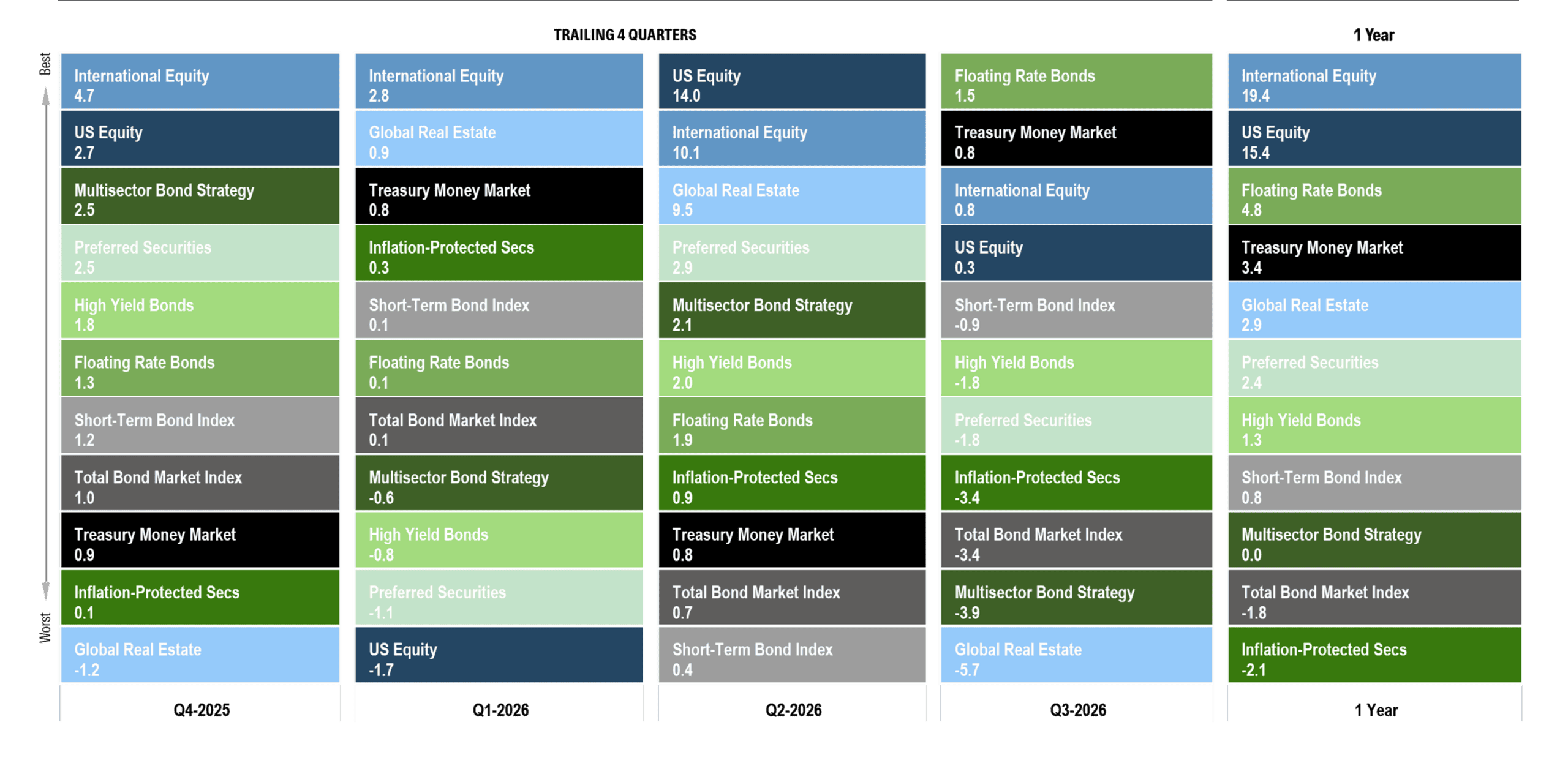 About this chart:This chart illustrates the performance of core public market segments for the prior four quarters and for the trailing one-year period. Each segment is represented by a different color and ranked from highest to lowest return for each period. This information is provided for illustrative purposes only and does not represent the performance of any Brighton Jones client portfolio. Past performance is not indicative of future results.
Key Takeaways:
The third quarter was quiet for stocks and difficult for bonds. After several years in which nearly every major asset class produced positive returns, it is tempting to view that divergence as unusual. It isn’t. In a properly diversified portfolio, we should expect some investments to be doing well while others are struggling. If everything behaved the same way at the same time, there would be little reason to diversify in the first place.
This quarter, the pressure fell on bonds. At the start of the year, markets were pricing in two Federal Reserve rate cuts. The military conflict with Iran that began in late February changed that outlook. Brent crude roughly doubled, from $61 per barrel at the start of the year to nearly $120 at its peak, while headline inflation climbed as high as 4.2%, its highest level in three years.
Bonds initially absorbed that change reasonably well. Investors hoped for a quick resolution, and income was enough to offset a gradual rise in yields through the first half of the year. The sharper repricing came in the third quarter, as the conflict settled into a standoff over the Strait of Hormuz and hopes for a reopening faded. The 10-year Treasury yield rose from 4.44% at the end of June to 5.29% at quarter-end, its highest level since 2002. In September, the Fed raised its policy rate for the first time since July 2023, lifting the federal funds range to 3.75% to 4.00%. Most fixed-income sectors lost ground, while floating-rate bonds held up best because their income resets higher as short-term rates rise.
None of this means diversification failed. Quite the opposite. Different investments respond to different economic forces, and the point of owning them together is not to have them all rise at once. It is to avoid depending on any one outcome. Over the past year, strong equity returns have more than offset disappointing returns in bonds, leaving overall portfolio returns solid. At other times the roles will reverse. That is the nature of diversification: there will always be something you wish you owned more of and something you wish you owned less of.
The decline in bond prices also comes with an important benefit: higher expected returns going forward. Money market funds currently yield about 3.5%. Short-term, high-quality bonds offer yields to maturity of roughly 4.5%, while the broad bond market yields about 5%. Credit-oriented sectors offer still higher expected returns in exchange for taking additional credit risk.
Our approach through this cycle has not changed. Rather than making a bet on any single point of the yield curve, we maintain exposure across a range of maturities. If rates fall, part of the portfolio is already locked into today’s higher yields. If rates rise, maturing bonds can be reinvested at those higher rates. Floating-rate exposure provides another source of adaptability along the way.
No single scenario is a win or a loss for the whole portfolio, which is precisely the point. We would rather be approximately right across many possible futures than precisely wrong about a single one.
Data Disclosures: Treasury Money Market: Fidelity Treasury Money Market. Short-Term Bond Index: Vanguard Short-Term Bond Index. Total Bond Market Index: Vanguard Total Bond Market Index. Inflation-Protected Treasuries: Vanguard Inflation-Protected Securities. Multisector Bond Strategy: PIMCO Income. Floating Rate Bonds: Fidelity Floating Rate. High Yield Bonds: PIMCO High Yield. Preferred Securities: Nuveen Preferred Securities. U.S. Stocks: DFA US Core Equity I. Foreign Stocks: DFA World ex US Core Equity. Global Real Estate: DFA Global Real Estate. Data source: Morningstar Direct as of September 30, 2026.
Footnote: The listed funds are used as market proxies for illustrative purposes only. They do not represent actual Brighton Jones client holdings, recommendations, model portfolios, or composite performance. Returns do not reflect the deduction of Brighton Jones advisory fees, transaction costs, taxes, or other expenses that would reduce returns.
Calendar Year Returns: Stocks vs. Bonds
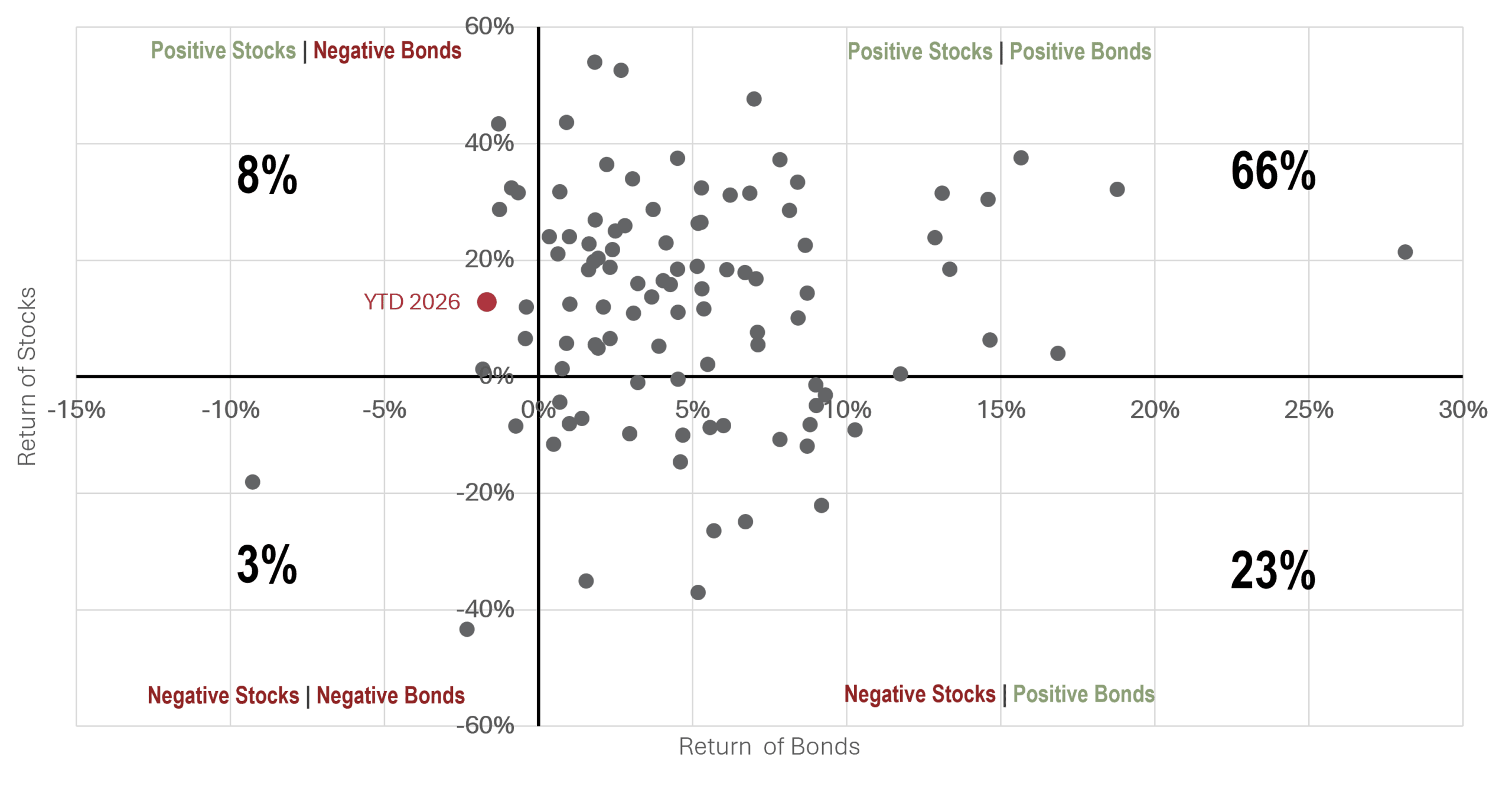 About this chart: This chart plots calendar-year returns for U.S. bonds on the horizontal axis and the U.S. stock market on the vertical axis since 1926. Each quadrant shows how often stocks and bonds produced positive or negative returns, either independently or at the same time. For example, bonds were positive in 89% of calendar years, represented by the two quadrants on the right side of the chart. Stocks and bonds were both positive in 66% of years, while both were negative in just 3%. Past performance is not necessarily indicative of future results.
Key Takeaway:
Historical data helps us understand what is normal, what is unusual, and what we should reasonably expect. This year’s combination—positive stocks and negative bonds—is uncommon, but not unprecedented: it has occurred 8 times in 101 years. More importantly, diversification has historically provided protection when it mattered most. Stocks declined in 26 of those 101 years, and bonds were positive in 23 of the 26. Stocks and bonds were negative together only 3 times. Diversification is not about having everything work at once. It is about reducing the odds that everything fails at once.
Data Disclosures: US Bonds: 5-Year US Treasury Index from January 1926 to January 1978; 50% Bloomberg US Government/Credit 1-5 Year Index and 50% Bloomberg US Aggregate Bond Index, rebalanced annually, from February 1978 to September 2026. US Stocks: S&P 500 Index. Data source: Dimensional Returns 2.0.
Starting Yields and Forward Returns
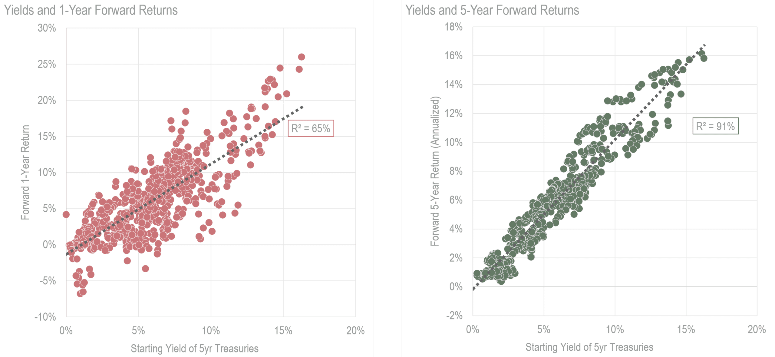
About this chart: These charts compare the starting yield on five-year U.S. Treasury bonds with the returns investors subsequently earned over one-year and five-year holding periods. The left chart shows how much realized returns can vary over shorter periods as bond prices respond to changing interest rates. The right chart shows that, as the holding period extends toward the bond’s maturity, realized returns converge much more closely toward the yield available when the investment was made.
Key Takeaways:
Bond returns are fundamentally different from stock returns because much of the return is contractual. If an investor purchases a five-year Treasury yielding 5% and holds it for five years, the annualized return should ultimately be close to that starting yield. Starting yield does not explain 100% of the eventual return because the interest payments received along the way must be reinvested, and we do not know in advance what rate will be available on those reinvestments.
Over shorter periods, however, changes in market interest rates can cause bond prices—and therefore reported returns—to move meaningfully above or below that starting yield. That is what we have experienced this year: rising rates have pushed bond prices lower in the short term, even as the income those bonds generate has continued to accrue.
The contrast between the two charts illustrates why the holding period matters. After one year, returns on a five-year bond can vary considerably. Over a five-year holding period, those temporary price movements matter much less, and realized returns tend to migrate toward the yield that was available at the outset.
Short-term bond returns can be noisy. Over a sufficiently long holding period, we expect returns to move much closer to the yield available when the bond was purchased.
Data Disclosures: Source: Federal Reserve of St. Louis; Dimensional Returns 2.0
Interest Rates: US Treasury Yield Curve
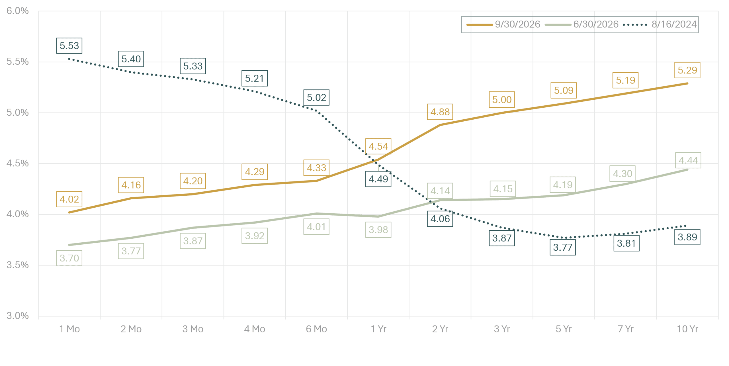 About this chart: This chart compares the Treasury yield curve one month before the first rate cut of the current cycle, at the end of the second quarter, and at the end of the third quarter.
Key Takeaways:
Since September 2024, the Federal Reserve has cut its target rate by a net 150 basis points, including a 25-basis-point increase in September 2026. Short-term Treasury yields largely followed those policy moves lower through midyear before moving higher again in the third quarter.
Longer-term yields followed a very different path. The 10-year Treasury yielded 3.89% in August 2024, 4.44% at the end of June, and 5.29% at the end of September. Rather than falling along with the Fed’s earlier rate cuts, long-term yields rose as investors reassessed inflation, economic growth, and the likelihood that rates would remain higher for longer.
The result is a very different yield curve from the one investors faced two years ago. In August 2024, the curve was deeply inverted, with short-term yields well above long-term yields. Today, it has returned to a more normal upward slope, with longer maturities offering higher yields than shorter ones.
The past two years are a good reminder that the yield curve does not move in parallel. Short-term yields largely followed the Fed lower, while longer-term yields moved higher. Nor is that unusual: in 2004 and 2005, the Fed raised short-term rates at nearly every meeting while the 10-year Treasury yield was little changed and at times moved lower.
Our approach reflects that uncertainty. Rather than making a concentrated bet on any single point of the curve, we maintain broad exposure across maturities. If rates fall, part of the portfolio is already locked into today’s yields. If rates rise, maturing bonds can be reinvested at higher rates.
Data Disclosures: Source: US Treasury
Market Expectations for Interest Rate Policy
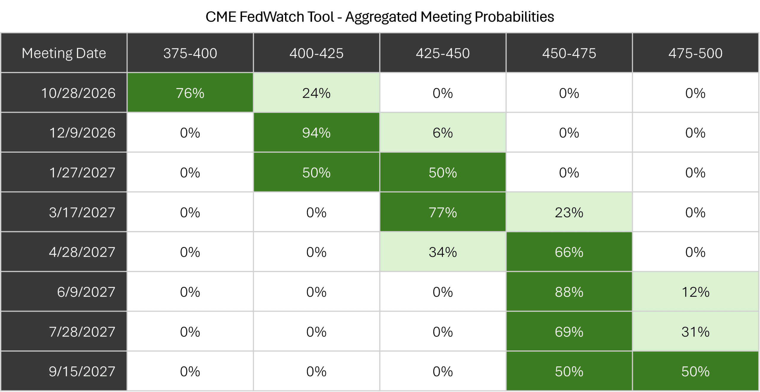
About this chart: This chart is a probability distribution table showing where the market believes the Fed Funds rate will be following upcoming Federal Reserve policy meetings, the dates of which are listed in the far-left column. The probabilities are derived from the prices of Fed Funds futures contracts that trade throughout the day. The logic behind the calculation is that current futures prices only make sense if these probabilities accurately reflect investor expectations. Of course, this does not mean investors will be right or that the future will unfold according to the expectations investors hold today.
Key Takeaways:
The change in expectations over the course of this year has been dramatic. At the beginning of 2026, markets were pricing in roughly two rate cuts. Rising energy prices and renewed inflation pressure reversed that outlook, and the Fed ultimately raised rates in September.
Markets now expect that increase to be the beginning of a broader adjustment. Another hike is nearly fully priced by December, a second is increasingly expected by early 2027, and by next spring the market’s base case has shifted toward a federal funds rate 75 basis points above today’s level. By September 2027, markets see roughly equal odds of three or four additional increases from here.
What is perhaps more important than the specific path is how much that path has changed. Less than a year ago, investors expected rates to move meaningfully lower. Today, they expect them to move higher. This table will almost certainly look different again as inflation, growth, and labor-market data evolve.
That is the useful lesson for investors. Market expectations contain valuable information about what is priced in today, but they are not a reliable roadmap for what comes next. The more uncertain the path of rates, the stronger the case for building a portfolio that does not depend on getting that path exactly right.
Data Disclosures: Source: CME FedWatch Tool
Inflation Trends
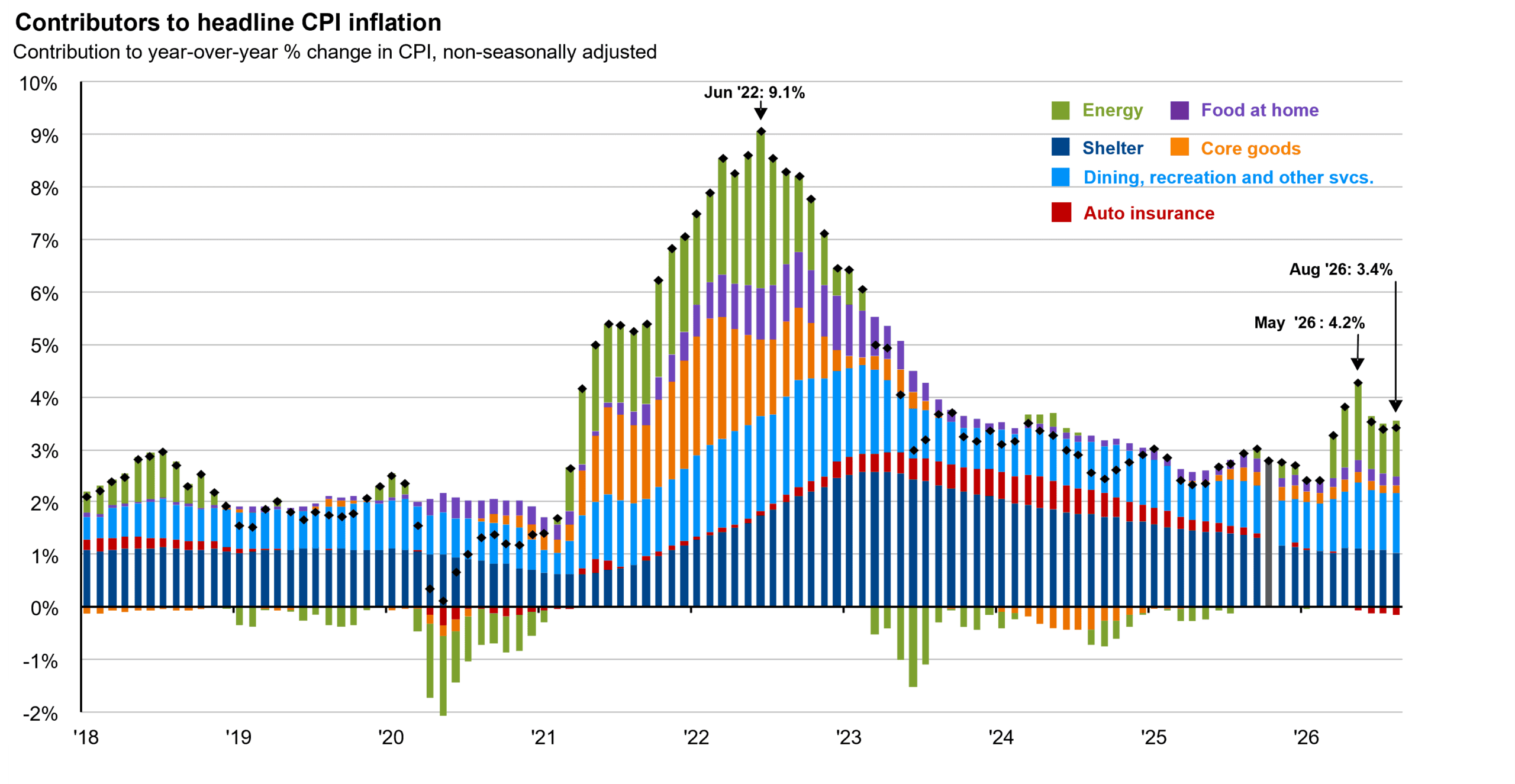 About this chart: This chart breaks down U.S. consumer price inflation by component, providing a clear view of what has been driving inflation in recent years. Headline inflation peaked in June 2022 amid the Ukraine/Russia war and post-pandemic supply disruptions, then moderated over the following three years before re-accelerating in 2026 as the Middle East conflict pushed energy prices sharply higher.
Key Takeaways:
Inflation has moved back into the center of the market conversation. Headline CPI reached 4.2% in May before easing to 3.4% by August, reversing part of the progress made over the prior several years and helping drive the shift in Federal Reserve policy expectations shown on the previous slide.
The composition of that increase matters. The 2022 inflation surge was broad, with meaningful contributions from energy, goods, shelter, and services. The 2026 reacceleration has been much more concentrated in energy. The underlying categories have not deteriorated to the same degree, which makes the current episode different from the inflation shock investors experienced four years ago.
That distinction is important for the outlook. If energy prices stabilize, their contribution to headline inflation could fade over time. The larger risk is that higher energy costs persist long enough to feed into wages, services, and other stickier categories, turning a relatively narrow supply shock into a broader inflation problem.
The level of inflation matters, but so does its source. A narrow energy-driven spike is a different problem from broad-based inflation across the economy.
Data Disclosures: Source: U.S. Bureau of Labor Statistics, FactSet, JP Morgan
US Dollar Index
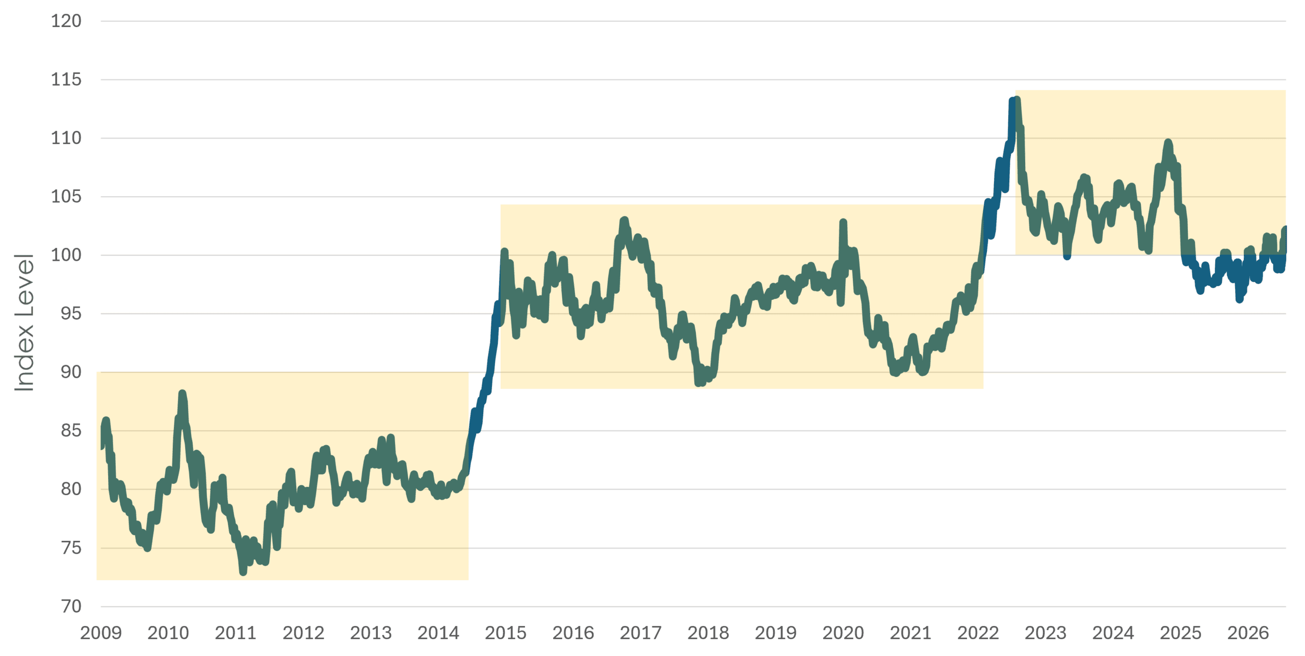
About this chart: This chart shows the U.S. Dollar Index (DXY) since the end of the global financial crisis. The index represents a weighted average value of the dollar against select currencies, including the euro, Japanese yen, British pound sterling, Canadian dollar, Swedish krona, and Swiss franc. Past performance is not indicative of future results.
Key Takeaways:
The dollar has strengthened since the beginning of the year, reversing much of the weakness that had prompted concern in 2025 and early 2026. Last year, as the dollar fell, we heard more questions from clients about whether they should add direct exposure to foreign currencies.
Our view remains that currency movements should not drive the portfolio allocation. International equities already provide meaningful exposure to foreign currencies, and those movements naturally become part of their return. A weaker dollar tends to help international holdings for a U.S. investor, while a stronger dollar creates a headwind.
The longer history in this chart is a useful reminder of how difficult those moves are to forecast. The dollar has often spent years trading within a broad range before moving sharply when economic conditions, interest-rate expectations, or capital flows changed. Those turning points are obvious in hindsight and difficult to anticipate in advance.
We would rather remain agnostic about the direction of the dollar and own investments that can benefit under different currency environments. When the dollar weakens, our foreign holdings receive a tailwind; when it strengthens, other parts of the portfolio tend to benefit. Currency is one more source of diversification, not something we believe anyone can reliably time.
Data Disclosures: Source: Investing.com
Calibrating Portfolio Positioning
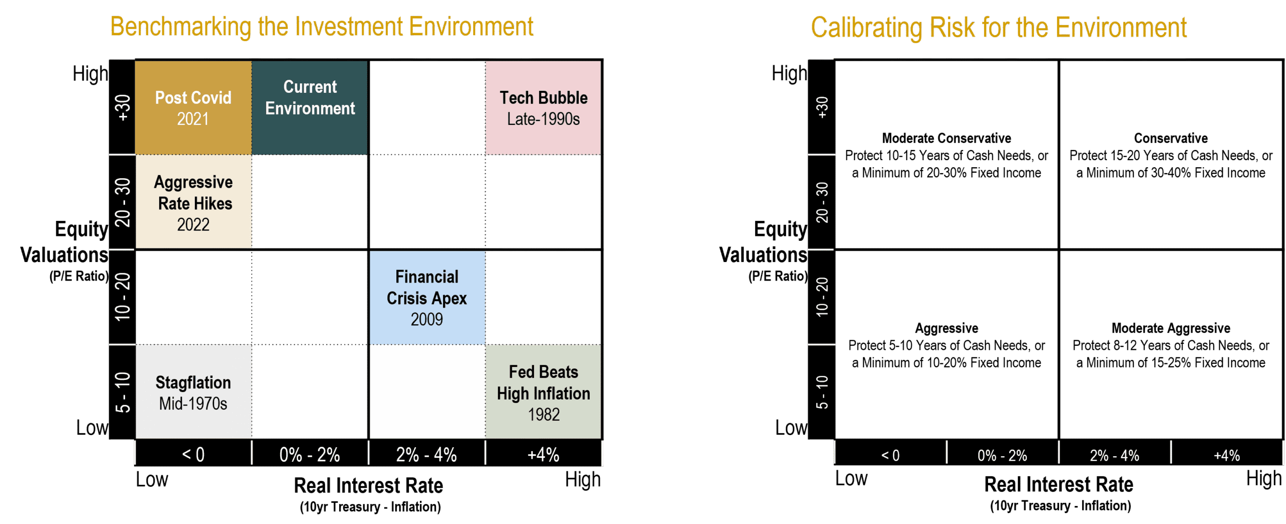
About this chart: This slide presents the framework we use to calibrate portfolio positioning based on the relative attractiveness of stocks and bonds. The two primary inputs are equity valuations and real interest rates. The chart on the left shows how we classify the investment environment using these two variables. The chart on the right shows the broad portfolio posture that would typically align with each environment. Lower valuations generally make equities more attractive. Higher real yields generally make fixed income more attractive.
Key Takeaways:
Historically, starting equity valuations have shown an inverse relationship with long-term future equity returns: lower starting valuations have generally led to better forward returns, while higher starting valuations have generally led to lower forward returns. In fixed income, starting yields exhibit a strong positive relationship with future returns, especially for bonds held to maturity or over a meaningful portion of their term.
This framework is meant to guide judgment, not drive mechanical changes. We consider portfolio adjustments only when the relative tradeoff between stocks and bonds shifts meaningfully, not simply when the absolute return outlook for each asset class changes on its own. Higher bond yields and lower equity valuations do not automatically call for a repositioning if both asset classes have improved by a similar degree.
For the past several years, the environment has generally fallen in the upper-left portion of the framework: elevated equity valuations alongside low-to-moderate real interest rates. That argues for a moderate risk posture with a meaningful allocation to fixed income across both high-quality and higher-yielding segments, which is where we have remained.
A couple of important observations help explain why today’s environment remains in the same quadrant. Fixed income now offers higher nominal yields, but inflation has also risen, leaving the real return available from bonds little changed. At the same time, equity markets have continued to advance, but healthy earnings growth has kept valuations from becoming materially more expensive. Those dynamics beneath the surface have preserved much of the relative balance between stocks and bonds. As a result, the framework continues to support the same overall risk posture.
Data Disclosures: This framework is provided for illustrative purposes only and does not represent a recommendation with respect to any individual client portfolio.
Disclosure: This content is for informational and educational purposes only and should not be construed as individualized advice. For individualized advice tailored to your specific circumstances, please consult with your adviser. Trust terms, governing law, and individual legal and tax circumstances vary, and the applicability and consequences of any trust strategy will depend on the particular facts. Brighton Jones, LLC is an SEC-registered investment adviser and is separate from its affiliate, Brighton Jones Trust Company, LLC, a South Dakota-chartered trust company. Fees for trustee and other fiduciary services provided by Brighton Jones Trust Company are separate from and in addition to fees charged by Brighton Jones, LLC.